How to Fix Poor Mobile Responsiveness and Keep Users Engaged!
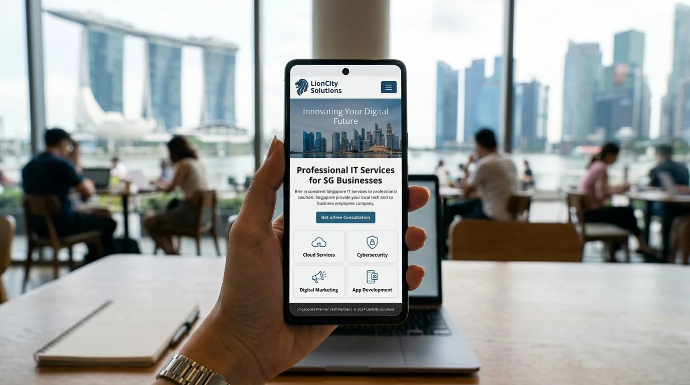
Try opening your own website on your phone right now. Can you read the text without squinting? Can you tap the menu button easily? Are images loading properly? If you struggled with any of this, your visitors are struggling too — and they are leaving.
In Singapore, over 70% of web browsing happens on mobile phones. If your website doesn't work well on a phone, you are automatically losing more than half your potential customers. The worst part: they won't even tell you they left. They just go to your competitor.
What is Mobile Responsiveness?
Mobile responsiveness means your website automatically adjusts its layout to fit whatever device the visitor is using — phone, tablet, or desktop. Text resizes, images shrink, buttons become big enough to tap with a thumb. A responsive website works everywhere without the visitor needing to zoom in or scroll sideways.
You can test your website easily: open it on your phone and tablet. If you have to pinch to zoom, scroll sideways to read a sentence, or tap the wrong buttons, your website is NOT mobile-friendly.
Step 1: Check if Your Website is Already Mobile-Friendly
Before fixing anything, find out where you stand. Go to Google's Mobile-Friendly Test (just search for it) and enter your website URL. Google will tell you if your page is mobile-friendly and why it might not be. This takes less than 1 minute and gives you a clear report. Bookmark the result — you will use it again after you make changes.
Step 2: Use a Mobile-Responsive Website Builder or Theme
If your website is more than 5 years old or was built with an outdated tool, it may not be responsive. The quickest fix is to switch to a modern website builder. Popular options include: Wix (drag-and-drop, mobile editor included), Squarespace (beautiful templates, all responsive by default), Shopify (if you have an online store), WordPress with a responsive theme (more control but requires some learning). If you are using WordPress, go to Appearance > Themes and search for a well-rated responsive theme. Many are free.
Step 3: Make Text Big Enough to Read Without Glasses
Small text is the number one complaint about mobile websites. Your body text should be at least 16 pixels. Your headings should be proportionally larger. Check your website's current text size: open your website on your phone, hold it at normal reading distance. Can you read the text comfortably? If not, go to your website editor and increase the font size. This is one of the easiest fixes with the biggest impact.
Step 4: Space Out Your Clickable Buttons
If your call-to-action buttons ("Contact Us," "Get a Quote," "Buy Now") are too close together, mobile users will tap the wrong one and get frustrated. Make sure buttons have at least 8 to 10 pixels of space between them. Each button should be at least 44 pixels tall — this is Apple's minimum tap target size and is a good standard to follow.
On mobile, your most important button should be visible without scrolling. For a service business, that is usually "Call Us Now" or "Get a Quote."
Step 5: Stack Your Content Vertically
On a desktop, you might have content in multiple columns side by side. On mobile, these should stack into a single column. Images should be full-width. Headings should be large and clear. White space helps readers rest their eyes. Think of how a Twitter post looks — short lines, clear separation, easy to scan. Your mobile website should feel like that.
Step 6: Optimize Images for Mobile Speed
Large images load slowly on mobile data. Slow websites frustrate visitors and hurt your Google ranking. Resize your images before uploading: if your website content area is 800 pixels wide, your images should be no more than 1600 pixels wide (2x for retina displays). Use free tools like TinyPNG (search for it online) to compress images without losing quality. If your website builder offers automatic image optimization, turn it on.
Step 7: Fix Your Navigation Menu for Mobile
Desktop websites usually show all menu items in a horizontal bar at the top. On mobile, this doesn't work. Your mobile menu should be a "hamburger menu" — three horizontal lines in the corner that, when tapped, opens a full-screen or slide-out menu. Make sure the menu is easy to close once opened. The menu should include: Home, About, Services/Products, Contact, and any other important pages. Avoid deep dropdown menus on mobile — keep navigation to 2 levels maximum.
Step 8: Enable Accelerated Mobile Pages (AMP) for Blog Posts
If you have a blog or news section, Google offers a technology called AMP (Accelerated Mobile Pages) that makes your articles load almost instantly on mobile. Not every website builder supports AMP, but if yours does (like WordPress with a proper plugin), it can significantly improve your mobile user experience and Google ranking for blog content.
Step 9: Test Everything on Real Devices
Emulators and testing tools are useful, but nothing beats real-world testing. Ask 5 friends or family members to open your website on their phones. Give them simple tasks like "find your phone number" or "contact you through the website." Watch what they struggle with. Note the issues and fix them one by one.
Common Mobile Mistakes Singapore Business Owners Make
Having a separate mobile site (m.domain.com): Old approach where you have two versions of your website. Modern websites use responsive design instead — one site that works everywhere. If you have an m.domain site, consider migrating to a responsive design.
Blocking zooming: Some websites prevent users from zooming in, which is terrible for readability. Make sure your website doesn't have this code: user-scalable=no in the viewport meta tag.
Pop-ups covering the whole screen: Those "Sign up for newsletter!" pop-ups that take over the entire screen on mobile are not just annoying — Google penalizes websites that do this.
Summary
Mobile responsiveness is not optional anymore — it is a requirement. Start by testing your current site, then work through these steps: switch to a responsive builder if needed, increase text size, space out buttons, stack content vertically, optimize images, fix your mobile menu, and test with real people. Each step takes less than an hour, and the improvement in visitor engagement will be noticeable within days.
If you have an existing website that is difficult to make mobile-friendly, or if you need a complete redesign that works perfectly on all devices, WebCareSG can help. We build mobile-first websites designed specifically for Singapore small businesses.
Related WebCare Solutions
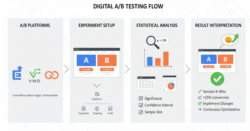
Set Up A/B Testing with Google Optimize Alternatives and Measure Results
A practical guide to setting up and measuring A/B tests using popular tools, understanding statistical basics, and interpreting results to make data-driven decisions.

Why DIY Website Fixes Can Sometimes Make Things Worse
Discover the hidden risks of attempting DIY website fixes and learn why it's often safer and more efficient to rely on professional website maintenance services.

Why Your Singapore Business Needs a Website Maintenance Plan in 2026
Discover why a website maintenance plan is critical for Singapore businesses in 2026. Learn how regular updates, security scans, and performance checks protect your investment and keep customers engaged.
Ready to get started?
Focus on your business while we fix your website. Contact WebCareSG today for fast, reliable solutions!
Whatsapp us on