How to Make Your Website Mobile-Friendly for Singapore Businesses
More than half of all website visitors in Singapore are now browsing on their mobile phones. If your website does not look good on mobile devices, you are probably losing customers without even knowing it. The good news is that making your website mobile-friendly is easier than you think, and you can do it yourself with some basic knowledge.
In this guide, we will walk you through practical steps to check if your website is mobile-friendly and fix common issues. You do not need to hire a developer for most of these fixes.
Step 1: Test Your Website on Mobile
The first thing you need to do is find out how your website looks on mobile devices. You can use Google's Mobile-Friendly Test tool by visiting search.google.com/test/mobile-friendly and entering your website URL. This free tool will tell you if your website is mobile-friendly and highlight specific issues if there are any.
You can also simply resize your web browser window to about the width of a phone screen - around 375 pixels wide. If your website requires scrolling left and right to read content, or if buttons are too close together, those are issues you need to fix.
Step 2: Use a Responsive Website Design
Responsive design means your website automatically adjusts its layout to fit whatever screen size is being used. If your website was built in the last five years, it probably already has responsive design. Older websites may need updating.
If you use WordPress, changing to a responsive theme can solve many mobile issues at once. Look for themes that advertise themselves as "responsive" or "mobile-first" in the theme directory. Before changing themes, make sure to backup your website in case anything goes wrong.
Step 3: Make Text Big Enough to Read
One of the most common mobile problems is text that is too small to read on a phone screen. Your website should use a base font size of at least 16 pixels for body text. Anything smaller becomes hard to read without zooming in.
In your website stylesheet, check your font-size settings. Increase them if needed. Also make sure your line height is set to around 1.5 times your font size - this makes text more comfortable to read on any screen.
Step 4: Space Out Tap Targets
Buttons and links that are too close together are a common problem on mobile websites. When someone tries to tap a small button on their phone, they often accidentally tap the wrong one. Make sure all clickable elements are at least 48 pixels apart from each other.
This includes navigation menus, form fields, buttons, and links. If your website has a contact form, make sure the name, email, and message fields have enough space between them so users can tap accurately.
Step 5: Avoid Flash and Pop-ups
Flash content does not work on most mobile browsers and can cause your website to crash on mobile devices. If your website uses Flash animations or videos, replace them with HTML5 alternatives which work on all devices.
Also avoid intrusive pop-ups on mobile. While pop-ups on desktop can be annoying, they can completely block content on mobile screens and frustrate visitors. If you must use pop-ups, make sure they can be easily closed and do not appear immediately when someone lands on your site.
Step 6: Optimize Images for Mobile
Large images slow down your website on mobile data connections. Use responsive images that automatically resize based on the device screen size. WordPress plugins like Smush or ShortPixel can automatically optimize images for you.
For custom websites, use the srcset attribute in your image tags to provide different image sizes for different screens. This way, mobile users download smaller, faster-loading images while desktop users get the full-size versions.
Conclusion
A mobile-friendly website is no longer optional - it is essential for any Singapore business that wants to reach customers online. With more people shopping and browsing on their phones than ever before, if your website does not work well on mobile, you are turning away potential customers.
Start by testing your current website using the tools we mentioned, then work through each step above. Most mobile improvements can be done without technical expertise. If you have been postponing this, now is the time to act. Your mobile visitors will thank you for it, and you will likely see better engagement and more conversions from your website traffic.
Related WebCare Solutions
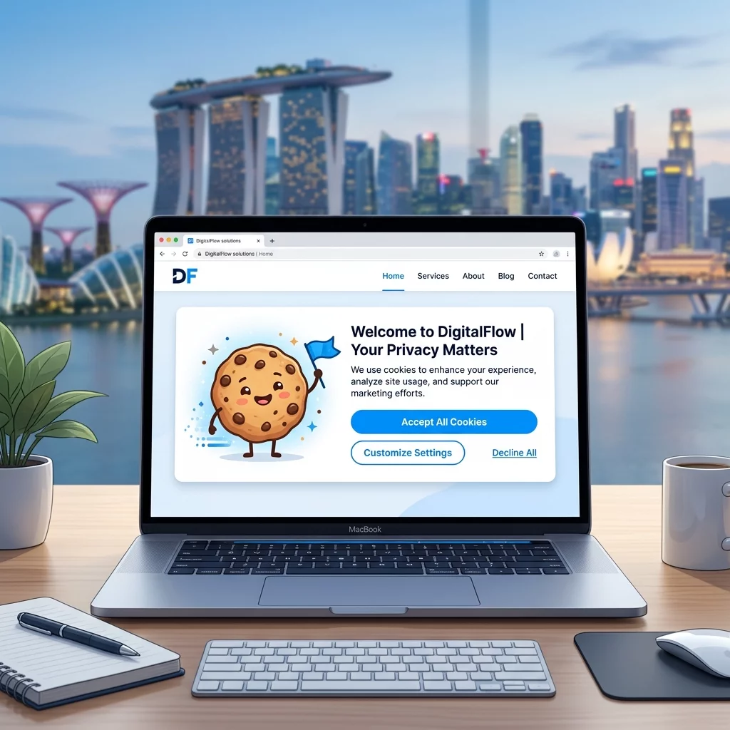
Cookies: How to Implement a Compliant Cookie Banner on Your Singapore Website
Learn step-by-step how to add a cookie consent banner to your Singapore website that complies with PDPA regulations. This guide covers free and paid options for WordPress, Shopify, and other platforms.
WooCommerce Sales Not Tracking in Google Ads? Fix It Now
A step-by-step guide to troubleshooting and fixing WooCommerce sales tracking issues in Google Ads, focusing on missing purchase events and correctly passing dynamic values via Google Tag Manager.

Understanding SSL Certificates: How to Choose the Right One for Your Website
Learn about SSL certificates, their importance for website security and SEO, and how to choose the right type for your website needs.
Ready to get started?
Focus on your business while we fix your website. Contact WebCareSG today for fast, reliable solutions!
Whatsapp us on