Beyond the Numbers: An Introduction to Website Heatmaps
You've delved into your Google Analytics 4 (GA4) reports, meticulously examining conversion rates, traffic sources, and user demographics. You know what is happening on your website – how many people visited, where they came from, and which pages they viewed. But what about the why? Why are users leaving a certain page? Why aren't they clicking that prominent call-to-action? This is where visual tracking tools, specifically website heatmaps, step in to bridge the gap between numbers and true user behavior.
What is Visual Tracking?
Visual tracking refers to a suite of tools that capture and display user interactions on your website in a visual, intuitive way. Instead of rows of data and graphs, you see overlays on your actual web pages, showing you exactly where users are looking, clicking, and scrolling. It's like looking over your users' shoulders, but without invading their privacy.
Introducing Website Heatmaps
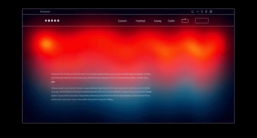
A website heatmap is a data visualization tool that represents user interaction data on a webpage using a color-coded overlay. Think of it like a weather map for your website, where "hotter" colors (red, orange, yellow) indicate areas of high activity and "cooler" colors (blue, green, purple) show areas of less activity.
The most common types of heatmaps include:
- Click Maps: These show you exactly where users click (or tap on mobile) on a page. Hotter spots indicate elements that receive the most clicks. This can reveal if users are clicking on non-clickable elements (dead clicks) or repeatedly clicking out of frustration (rage clicks).
- Scroll Maps: These visualize how far down the page users scroll. They use a gradient from hot to cold to show the percentage of users who viewed each section of the page. This helps you understand where users lose interest and where your most important content should be placed.
- Movement Maps (or Hover Maps): These track mouse movements (on desktop) to show where users are moving their cursors. While not always indicative of eye-tracking, mouse movement often correlates with user attention.
How Heatmaps Complement Google Analytics
Google Analytics (especially GA4) excels at quantitative data. It tells you the metrics: how many users, how many conversions, bounce rates, time on page, etc. GA4 is fantastic for answering "what" questions:
- What are my top-performing pages? (Traffic Acquisition Report)
- What percentage of users complete a purchase? (Funnel Exploration Report)
- What devices are my visitors using? (Tech Details Report)
However, GA4 often leaves you wanting more context. This is where heatmaps shine. Heatmaps provide qualitative insights and answer the "why" questions:
- Why aren't users clicking my CTA? A click map might show it's being ignored, or that users are clicking something else nearby.
- Why are users abandoning my long-form content? A scroll map will show you exactly where they stop reading, indicating content fatigue or a confusing section.
- Why are users getting frustrated? Some heatmap tools integrate "rage click" detection, showing you areas where users repeatedly click something that isn't working.
- Are users seeing my key information? A scroll map helps confirm if important sections are "below the fold" (requiring a scroll to see) for a significant portion of your audience.
By combining the quantitative power of GA4 with the visual insights from heatmaps, you gain a holistic understanding of your website's performance and user experience. GA4 tells you there's a problem (e.g., low conversion rate on a page), and heatmaps help you diagnose the problem (e.g., users aren't seeing the form, or are getting stuck on a particular section).
Getting Started with Heatmaps: Microsoft Clarity
While many excellent heatmap tools exist (e.g., Hotjar, Crazy Egg, Mouseflow), many come with a cost or have limitations on their free plans. For anyone looking to dip their toes into visual tracking without commitment, Microsoft Clarity is an exceptional, completely free, and user-friendly tool.
Why Microsoft Clarity is a Great Starting Point:
- 100% Free: Clarity offers all its features, including unlimited heatmaps and session recordings, at no cost. There are no traffic limits or hidden fees.
- Easy Installation: You can typically install Clarity by adding a small JavaScript code snippet to your website's
<head>section. It also has easy integrations for platforms like WordPress and Shopify, or via Google Tag Manager. - Core Heatmap Types: It provides robust click maps and scroll maps for all your pages.
- Session Recordings: Beyond heatmaps, Clarity also records individual user sessions, allowing you to watch replays of how users navigate, click, and scroll through your site. This is invaluable for understanding specific user journeys.
- Insights into Frustration: Clarity automatically identifies "rage clicks," "dead clicks," and "excessive scrolling," highlighting potential areas of user frustration.
- Google Analytics Integration: Clarity can be linked to your GA4 property, allowing you to seamlessly move between quantitative GA4 data and qualitative Clarity insights.
- Intuitive Interface: Its dashboard is clean and easy to navigate, making it accessible even for those new to analytics.
To get started, simply visit the Microsoft Clarity website, sign up for a free account, and follow the simple instructions to add the tracking code to your website. Within minutes, you'll start collecting invaluable visual data.
Don't just track the numbers; understand the human behavior behind them. Heatmaps offer a powerful visual dimension to your website analytics, empowering you to make data-driven decisions that truly improve your user experience and conversion rates. Pair them with your GA4 insights, and you'll unlock a new level of understanding about your online audience. Need help setting up or interpreting your website heatmaps? The team at WebCareSG is ready to assist. Contact us today.
Related WebCare Solutions

How to Optimize Website Images Without Sacrificing Quality
Learn the best techniques to optimize website images for faster load times without compromising quality, improving user experience and SEO.
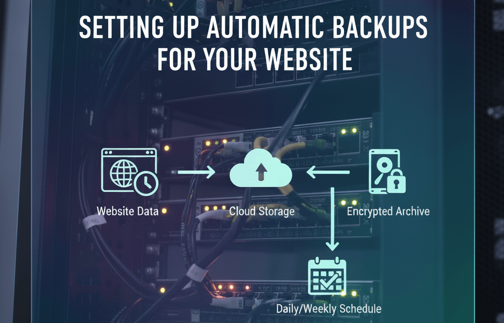
Setting Up Automatic Backups for Your Website
A detailed, step-by-step guide on configuring automatic backups, choosing the right tools, and establishing a recovery plan to protect your digital assets.

5 Signs Your Website Needs Maintenance (And How to Fix It)
Discover the 5 critical signs that indicate your website requires immediate maintenance. Learn how to address these issues to ensure optimal performance, security, and user experience.
Ready to get started?
Focus on your business while we fix your website. Contact WebCareSG today for fast, reliable solutions!
Whatsapp us on