Setting Up a Custom Dashboard That Shows Sales, Leads and Engagement
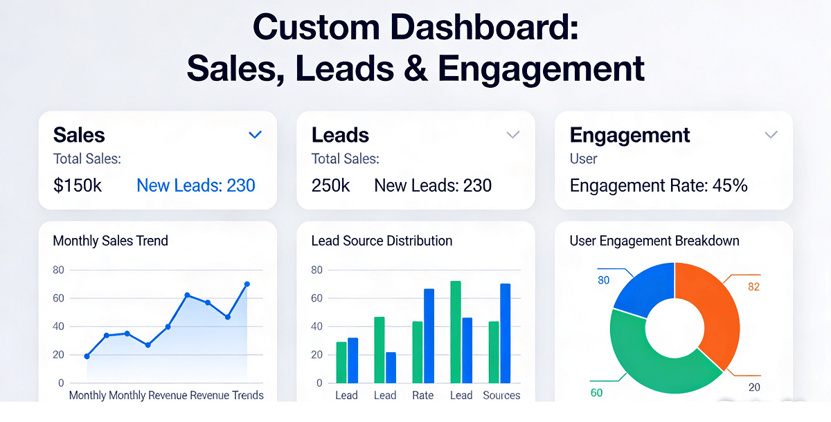
When you run a business in Singapore, understanding how your website performs should not require a computer science degree. Yet many small business owners find themselves staring at confusing analytics dashboards, wondering what all those numbers mean and whether they actually tell them anything useful. The truth is, your website generates a constant stream of valuable data about your customers, your sales pipeline, and how people interact with your business online. But that data only becomes powerful when you can see it clearly, all in one place, without juggling multiple tabs or trying to remember which report you looked at last Tuesday.
This is where a custom dashboard changes everything. Instead of logging into Google Analytics to check visitor counts, then opening another browser tab for your CRM to see leads, then checking your email for form submissions, you can have a single screen that shows you exactly what matters for your Singapore business right now. Sales figures, new enquiries, engagement metrics, and performance trends all visible at a glance. The good news is that setting this up does not require any coding knowledge or expensive enterprise software. With the right approach and a few free or low-cost tools, you can build a dashboard that works for your specific business needs within an afternoon.
Why Your Singapore Business Needs a Custom Dashboard
Singapore businesses rely heavily on digital presence to attract customers, whether they operate a retail shop in Jurong, a dental clinic in Tampines, or an online store serving customers across Southeast Asia. Your website acts as a silent salesperson, working around the clock to capture leads, process enquiries, and convert visitors into customers. But how do you know if that silent salesperson is actually performing? Without a clear view of your data, you are essentially driving blind.
A custom dashboard solves this problem by consolidating all your key metrics into a single, easy-to-understand interface. You can see at a glance whether your website traffic is growing or declining, which pages attract the most interest, whether your lead capture forms are actually working, and how effectively your marketing efforts translate into real business outcomes. This visibility allows you to make decisions based on actual data rather than guesswork, allocating your marketing budget more effectively and identifying problems before they become expensive mistakes.
For Singapore business owners specifically, the ability to track local performance matters enormously. Whether you are optimising for Singapore keywords in Google searches, running promotions targeted at HDB dwellers, or tracking enquiries from specific neighbourhoods, a well-designed dashboard lets you see exactly where your local customers come from and how they behave on your site.
Step 1: Identify the Data Sources That Matter for Your Business
Before you start building anything, you need to understand exactly what information would genuinely help you run your business better. A dashboard that tries to show everything often ends up showing nothing clearly, because the sheer volume of data becomes overwhelming. Start by asking yourself a simple question: what are the three or four numbers that tell me whether my business is doing well this week?
For most Singapore small businesses, those numbers typically fall into three categories. First, sales data, which might come from your e-commerce platform, point-of-sale system, or manual tracking of confirmed orders. Second, leads and enquiries, which include anyone who contacted you through your website, whether via a contact form, WhatsApp button, phone call, or email signup. Third, engagement metrics that show how visitors interact with your website, including page views, time on site, bounce rate, and which specific pages or products attract the most attention.
Make a list of every data source you currently use or could theoretically access. This might include Google Analytics for website traffic, your CRM or spreadsheet for sales leads, Mailchimp or another email tool for newsletter performance, Facebook Insights if you run a business page, your online store admin panel for orders, and any other platforms where your business data lives. Write them all down, because the next step involves connecting these sources into your dashboard.
Step 2: Choose the Right Dashboard Platform for Your Budget and Technical Comfort
Several tools make it surprisingly easy to build a professional dashboard without any technical skills. The best choice for you depends on your budget, how much data you need to combine, and whether you prefer a simple drag-and-drop interface or are willing to learn slightly more complex tools for greater flexibility.
Google Data Studio, now called Looker Studio, offers a free and powerful option for businesses already using Google products. It connects seamlessly with Google Analytics, Google Ads, Google Sheets, and many other Google services. You can create reports that update automatically, share them with your team, and embed them on your website. The interface uses a drag-and-drop builder that makes it accessible for non-technical users while offering enough depth to create genuinely useful visualisations.
Metabase provides an open-source alternative that works well for businesses with some technical comfort. It connects to databases directly, allowing you to write simple queries that pull data from various sources and display it as charts and graphs. While it requires a bit more setup knowledge than Google Data Studio, it offers greater flexibility and runs on your own servers if you prefer not to store data in the cloud.
Notion, while primarily known as a note-taking and productivity tool, actually works remarkably well as a lightweight dashboard solution. You can create databases within Notion, link them to other data sources using tools like Zapier, and display key metrics in a clean grid or gallery view. Many Singapore business owners already use Notion for internal operations, making this a natural extension that requires learning only one tool rather than several.
For businesses that need something even simpler, a well-structured Google Sheet combined with the right add-ons can serve as an surprisingly effective dashboard. Google Sheets is free, accessible from any device, and can be set up to automatically pull data from other services using built-in connectors or third-party add-ons from the Google Workspace Marketplace.
Step 3: Set Up Your Google Analytics Correctly for Singapore-Focused Tracking
If you have not already installed Google Analytics on your website, doing so forms the foundation of most dashboards. The free version, Google Analytics 4, provides substantial data for small businesses and connects easily with most dashboard tools. Setting it up correctly from the beginning saves enormous frustration later when you try to build meaningful reports.
Start by creating a Google Analytics account at analytics.google.com and following the setup process for your website. You will need to add a small piece of tracking code to every page of your website, which typically involves pasting a code snippet into your website header. Most website platforms like WordPress, Wix, or Shopify have simple plugins or built-in settings that handle this without touching any code. If you use a custom website built by a developer, ask them to add the tracking code for you.
Once installed, configure your reporting views to focus on the data that matters for your Singapore business. In your Google Analytics admin panel, set your timezone to Singapore GMT+8 so all reports display times correctly. Create a filter that includes only traffic from Singapore if your business serves primarily local customers, which keeps your data cleaner by excluding overseas bots and spam traffic that can skew your numbers.
Set up goals that track the specific actions visitors take on your site. Create a goal for each type of enquiry you care about, whether that is someone submitting a contact form, clicking to call your phone number, signing up for your newsletter, or completing a purchase. Goals convert your analytics data from abstract page views into meaningful business metrics that tell you whether your website actually generates customers.
Step 4: Connect Your CRM and Lead Data Sources
Knowing how many people visit your website tells only half the story. You also need to track what happens after a visitor becomes a lead. When someone fills out a form on your site, where does that information go? Does it automatically enter your CRM, or does it sit in an email inbox that you check manually? Creating a seamless flow from website visitor to tracked lead in your dashboard requires connecting your various data sources.
If you use a CRM system like HubSpot, Salesforce, Zoho, or Pipedrive, check whether they offer built-in analytics or direct integrations with dashboard tools. Most modern CRM platforms have their own reporting features that might already meet your needs before you invest time in building something custom. Connect your CRM to your dashboard using native integrations or automation tools like Zapier, which can move data between apps automatically without requiring any coding knowledge.
For businesses that manage leads through spreadsheets, the process requires slightly more manual effort but remains entirely achievable. Set up a Google Sheet as your central repository for lead data, and use tools like Zapier or Google Forms to automatically capture submissions from your website directly into that sheet. Configure your form to capture the specific information you need, such as customer name, contact details, enquiry type, and source. Once the data flows automatically from your website forms into a structured spreadsheet, you can easily pull those numbers into your dashboard.
Step 5: Design Your Dashboard Layout for Maximum Clarity
The most common mistake when building a dashboard is trying to display too much information. A dashboard cluttered with dozens of metrics becomes as hard to interpret as the raw data it attempts to simplify. Design your dashboard with the understanding that you will glance at it for thirty seconds each morning while drinking your morning coffee. If nothing on the screen immediately tells you the health of your business in that thirty seconds, you have included too much or organised it poorly.
Organise your dashboard into clear sections, with the most critical metrics occupying the largest and the most prominent positions. A typical layout for a Singapore small business might reserve the top quarter of the screen for a traffic overview showing daily visitors, comparison to the previous day, and a seven-day trend line. Below that, create distinct sections for sales metrics, lead generation performance, and engagement indicators, each using a consistent visual format that makes patterns easy to spot.
Choose chart types that match the nature of each metric. Use line graphs for tracking changes over time, such as how your weekly visitors have evolved over the past three months. Use bar charts for comparing different categories, such as which service pages attract the most traffic. Use simple number displays or gauge charts for metrics that need immediate attention, such as whether today you have received more or fewer enquiries than yesterday. Avoid pie charts for more than three or four categories, as they become visually confusing and hard to interpret accurately.
Pick a consistent colour scheme that makes reading your dashboard intuitive rather than overwhelming. Using green for positive metrics, red for problems that need attention, and neutral colours for informational displays creates an instant visual language that your brain learns to interpret within days. Keep the overall palette limited to three or four colours plus neutrals, and use those colours consistently throughout every element of your dashboard.
Step 6: Build Your First Dashboard Using Google Looker Studio
With your data sources identified and your layout planned, it is time to start building. Google Looker Studio provides the most accessible starting point for most Singapore small businesses, offering free access with generous data limits and seamless integration with Google Analytics and Google Sheets. Open Looker Studio and start a new report using the blank template, which gives you complete control over every element.
Add your Google Analytics property as a data source by clicking the Add Data button, selecting the Google Analytics connector, and authorising access to your account. Once connected, you can drag metrics directly onto your canvas and configure them using the properties panel on the right side of the screen. Start with your most important metric, such as total website sessions over the past seven days, and position it prominently in the top left corner of your canvas.
Add a line chart showing your daily traffic trend by dragging the Chart element onto your canvas, selecting Line Chart, and configuring it to display sessions organised by date over your preferred time range. Most dashboards benefit from showing at least thirty days of historical data so you can spot trends rather than just seeing single-day snapshots. Connect additional data sources for your CRM or lead tracking spreadsheet using the same Add Data process, then create charts that pull from those sources alongside your Google Analytics data.
Add scorecard components that show your most critical individual numbers with clear labels. Create one scorecard for total sessions today, another for new leads this week, and a third showing conversion rate. Each scorecard should include a comparison to the previous period so you can immediately see whether you are ahead or behind. Looker Studio calculates these comparisons automatically when you configure the data source correctly, showing numbers like "+12%" or "-5%" in green or red respectively.
Step 7: Add Geographic and Behavioural Segmentation Relevant to Singapore
Singapore is a small country, but the differences between neighbourhoods, housing types, and demographic groups matter enormously for local businesses. Your dashboard should segment your data in ways that reveal these local patterns, helping you understand which parts of Singapore your website attracts and which might be underserved.
Add a geographic breakdown to your traffic reports, showing which parts of Singapore your visitors come from. Google Analytics automatically tracks city and region data for most visits, allowing you to see whether your traffic comes primarily from the North, South, East, or West of Singapore, or whether specific districts like the CBD, Jurong, or Changi dominate your audience. This information directly informs marketing decisions, helping you understand whether your current digital marketing reaches your actual target market.
For businesses that serve specific customer segments, add behavioural segmentation that reveals how different types of visitors use your site. Create a segment for returning visitors versus new visitors, then compare metrics like pages per session and conversion rates between these groups. If returning visitors convert at significantly higher rates than new visitors, it tells you that your onboarding or first-visit experience might need improvement. If new visitors dominate your traffic but rarely convert, your value proposition might need clarification above the fold.
Track the performance of Singapore-specific landing pages and content. If you have created pages targeting Jurong, Woodlands, or specific neighbourhoods, monitor how these pages perform compared to your general content. Add a filter or custom dimension that lets you see which Singapore-specific keywords or locations generate the most valuable traffic for your business goals.
Step 8: Set Up Automated Reporting and Alerts
A dashboard you have to manually open and review every single day will eventually get neglected, no matter how well designed it is. Build in automation that delivers the most important information to you automatically, so you never miss a significant change in your business performance even on days when you do not have time to open your dashboard.
Configure email reports in Looker Studio that send you a weekly summary of your key metrics every Monday morning. These reports should include your core metrics in a visual format that makes trends obvious without requiring you to open the full interactive dashboard. Many business owners find that a well-designed weekly email report provides enough information for regular monitoring, reserving the full dashboard for deeper analysis when specific questions arise.
Set up Google Analytics alerts that notify you when significant changes occur in your traffic patterns. You can configure custom alerts to notify you via email when daily sessions drop below a threshold that indicates a potential technical problem or when they spike unexpectedly, potentially indicating a successful campaign or unexpected viral content. These automated checks provide peace of mind that you will learn about major changes even while you focus on running your business.
For lead tracking, configure notifications in your CRM or spreadsheet tools that alert you when new high-value leads arrive. If a lead meets certain criteria that indicates serious purchase intent, such as requesting a quote for a large order or indicating an urgent timeline, getting an immediate WhatsApp or email notification lets you respond quickly while the enquiry is fresh. Fast response times dramatically improve conversion rates for quality leads.
Step 9: Review and Refine Your Dashboard Monthly
A dashboard is not a one-time project but an evolving tool that should improve alongside your business. Set a recurring calendar reminder to review your dashboard setup at least once per month, examining whether the metrics you track still align with your current business priorities and whether any data gaps have emerged that need addressing.
Ask yourself during each monthly review whether you actually use every element currently displayed on your dashboard. Remove or minimise anything that you find yourself ignoring, and add new metrics whenever your business priorities shift. Your first version should be simple, but each iteration should add the elements that prove genuinely useful in running your business.
Pay attention to which insights from your dashboard actually change your decisions or behaviour. If you notice a metric regularly influences how you allocate marketing budget, adjust that element to be more prominent and detailed. If you find yourself ignoring certain data entirely, consider whether it should be removed to keep the dashboard clean and focused on actionable information rather than vanity metrics.
As your business grows, your dashboard should grow with it. What works for tracking five leads per week might not scale when you are managing fifty. Plan for regular reviews and updates, setting aside time every quarter to assess whether your current setup still serves your needs or whether you have outgrown certain features and require more sophisticated tracking.
If you still need help, feel free to contact us at https://webcare.sg/contact for a free website health check.
Related WebCare Solutions

How to Identify and Resolve DNS Configuration Issues
Learn how to troubleshoot and resolve common DNS configuration issues affecting your website’s performance and accessibility.
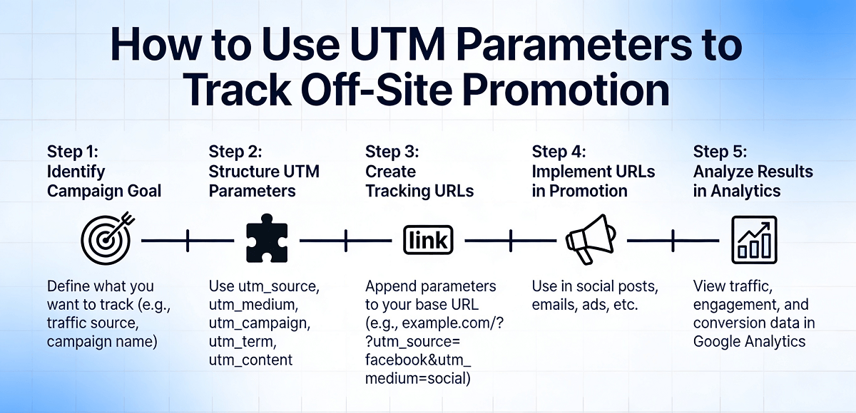
How to Use UTM Parameters to Track Off-Site Promotion
Learn how to use UTM parameters to accurately track which marketing channels bring visitors to your website. This step-by-step guide is written for Singapore business owners with no technical background, covering everything from setting up your first UTM URL to analyzing the data in Google Analytics.

How to Fix Slow Website Loading Time in Singapore
A step-by-step guide for Singapore business owners to identify and fix slow website loading issues themselves.
Ready to get started?
Focus on your business while we fix your website. Contact WebCareSG today for fast, reliable solutions!
Whatsapp us on