Why Does My Website Look Different on Phones? (Testing Tools, Common Mobile Bugs)

In today's digital landscape, a significant portion of website traffic originates from mobile devices. If your website looks and functions perfectly on a desktop but appears distorted, broken, or unusable on smartphones, you're likely losing a substantial number of potential customers and providing a poor user experience. Understanding why your website might look different on phones and knowing how to fix these issues is crucial for success. This detailed guide will explore common reasons for mobile display problems and provide step-by-step solutions, along with essential testing tools.
Understanding Mobile Responsiveness
A website designed with mobile responsiveness adapts its layout, content, and functionality to fit the screen size and orientation of the device it's being viewed on. A responsive design ensures a consistent and optimal user experience across desktops, tablets, and smartphones. When a website isn't responsive or has mobile-specific issues, it can lead to a drastically different and often negative experience on phones.
1. Lack of a Responsive Design
The most fundamental reason for a website looking different (and often broken) on phones is the absence of a responsive design. Older websites built without responsive principles use fixed layouts that don't scale down for smaller screens, resulting in horizontal scrolling, zoomed-out text, and misaligned elements.
How to Fix: Implement a Responsive Design
-
Use a Responsive Theme or Framework: If you're using a Content Management System (CMS) like WordPress, choose a theme that is explicitly labeled as "responsive." Many modern themes are built with responsiveness in mind. Alternatively, consider using a responsive CSS framework like Bootstrap or Foundation as the foundation of your design.
-
Implement Media Queries in CSS: Media queries are a CSS technique that allows you to apply different styles based on the characteristics of the viewing device, such as screen width, height, and orientation. By using media queries, you can adjust font sizes, layout structures (e.g., switching from a multi-column layout to a single column), and hide or show elements specifically for mobile devices.
-
Ensure Flexible Layouts: Avoid using fixed widths for containers and elements. Instead, use relative units like percentages (
%) or viewport units (vw,vh) to allow elements to scale fluidly with the screen size. -
Use Flexible Images and Videos: Images and videos with fixed widths can overflow their containers on smaller screens. Use CSS to make them responsive. For images,
max-width: 100%; height: auto;is a common approach. For videos, you might need to use more complex techniques or embed them from responsive platforms like YouTube or Vimeo.Learn more about how to fix poor mobile responsiveness.
2. Incorrect Viewport Settings
The viewport meta tag tells the browser how to control the page's scaling and dimensions on different devices. An incorrect or missing viewport meta tag is a common culprit for mobile display issues.
How to Fix: Configure the Viewport Meta Tag
-
Ensure the Meta Tag is Present: Open your website's
<head>section (usually in yourheader.phpfile if using WordPress or in the main HTML template). Look for the following meta tag:<meta name="viewport" content="width=device-width, initial-scale=1.0">
-
Understand the Attributes:
-
width=device-width: Sets the width of the viewport to the width of the device screen. -
initial-scale=1.0: Sets the initial zoom level when the page is first loaded to 100%.
-
-
Add or Modify the Meta Tag: If the viewport meta tag is missing or has different attributes, ensure it's included exactly as shown above within the
<head>section of your HTML.
3. Common Mobile-Specific CSS Issues
Even with a responsive design in place, specific CSS properties or values can cause unexpected behavior on mobile devices.
How to Fix Common Mobile CSS Bugs:
-
Fixed Widths on Small Elements: Ensure that even small elements like buttons or icons don't have fixed widths that might cause overflow on narrow screens. Use relative units or consider using icon fonts or SVG icons that scale better.
-
Text Overflow: Long strings of text without spaces can break layouts on mobile. Use CSS properties like
overflow-wrap: break-word;orword-break: break-all;to prevent text from overflowing its container. -
Font Sizes Too Small: Default font sizes can appear very small on high-resolution mobile screens. Use relative units like
emorremfor font sizes, or adjust them specifically for mobile using media queries to ensure readability. -
Issues with Fixed Positioning: Elements with the CSS property
position: fixed;can behave unexpectedly on mobile, sometimes covering content or not scrolling correctly. Test fixed elements thoroughly on various mobile devices and consider alternative solutions likeposition: sticky;or adjusting their behavior with media queries. -
Problems with Hover Effects: True hover effects don't exist on touchscreens. Ensure that any functionality triggered by
:hoveris also accessible through a click or tap. Consider using JavaScript to provide alternative interactions for mobile. -
Image Optimization for Mobile: Large, unoptimized images can take a long time to load on mobile networks, leading to a poor user experience and layout shifts. Optimize your images by compressing them and serving appropriately sized images for different screen resolutions using the CSS
max-width: 100%; height: auto;or the HTML5<picture>element orsrcsetattribute in the<img>tag.Learn how to speed up your site for better mobile performance.
4. JavaScript Issues on Mobile
JavaScript can enhance website interactivity, but sometimes scripts can behave differently or cause errors on mobile devices due to performance limitations or touch-based interactions.
How to Fix Mobile JavaScript Problems:
-
Optimize JavaScript Performance: Minimize the use of heavy or unnecessary JavaScript, especially on mobile. Optimize your code for performance to ensure smooth animations and interactions.
Find out why your website might be slow on mobile.
-
Test Touch Events: Ensure that any interactive elements relying on mouse events (like
onclick,onmouseover) also have appropriate touch event listeners (touchstart,touchend,touchmove) for mobile devices. -
Avoid Browser-Specific JavaScript: Try to use cross-browser compatible JavaScript. Test your scripts on different mobile browsers (Chrome Mobile, Safari Mobile, Firefox Mobile) to identify and fix any compatibility issues.
5. Testing Your Website on Mobile Devices
Thorough testing is essential to identify and fix mobile display issues. Relying solely on resizing your desktop browser window is not sufficient, as it doesn't accurately simulate the touch interactions and rendering of real mobile devices.
Essential Mobile Testing Tools:
-
Physical Mobile Devices: The most accurate way to test is on a range of actual smartphones and tablets with different screen sizes and operating systems (iOS and Android).
-
Browser Developer Tools (Device Mode): Modern browser developer tools (e.g., Chrome DevTools, Firefox Developer Tools) offer a "Device Mode" or "Responsive Design Mode" that allows you to simulate various screen sizes, resolutions, and even network conditions.
-
Online Mobile Emulators and Simulators: Several online tools and software emulators (like BrowserStack, Sauce Labs) provide more advanced testing environments across a wide range of virtual devices and browsers.
-
Google Mobile-Friendly Test: Google's own tool analyzes your page and tells you if it's mobile-friendly and identifies any usability issues on mobile. Google Mobile-Friendly Test
By understanding the principles of responsive design, addressing common mobile-specific bugs, and utilizing effective testing tools, you can ensure that your website provides a consistent and positive experience for all users, regardless of the device they are using. If you need professional assistance in making your website fully mobile-responsive and fixing display issues on phones, don't hesitate to contact WebCareSG for expert support.
Related WebCare Solutions
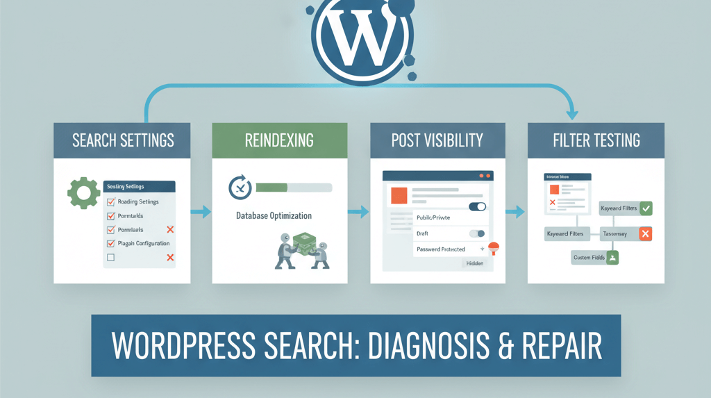
Search on Site Returns No Results or Wrong Items
A comprehensive guide to troubleshooting and fixing why your WordPress site search isn’t working, with steps to check settings, reindex content, and confirm post visibility.

How to Protect Against Hacks and Recover from Security Breaches
By taking immediate action, cleaning up the hack, and implementing robust security measures, you can protect your website from future threats.

Strange Characters on Website? Encoding Fixes
Detailed guide to troubleshooting and fixing issues with strange character display on websites, focusing on UTF-8 encoding problems and database collation.
Ready to get started?
Focus on your business while we fix your website. Contact WebCareSG today for fast, reliable solutions!
Whatsapp us on