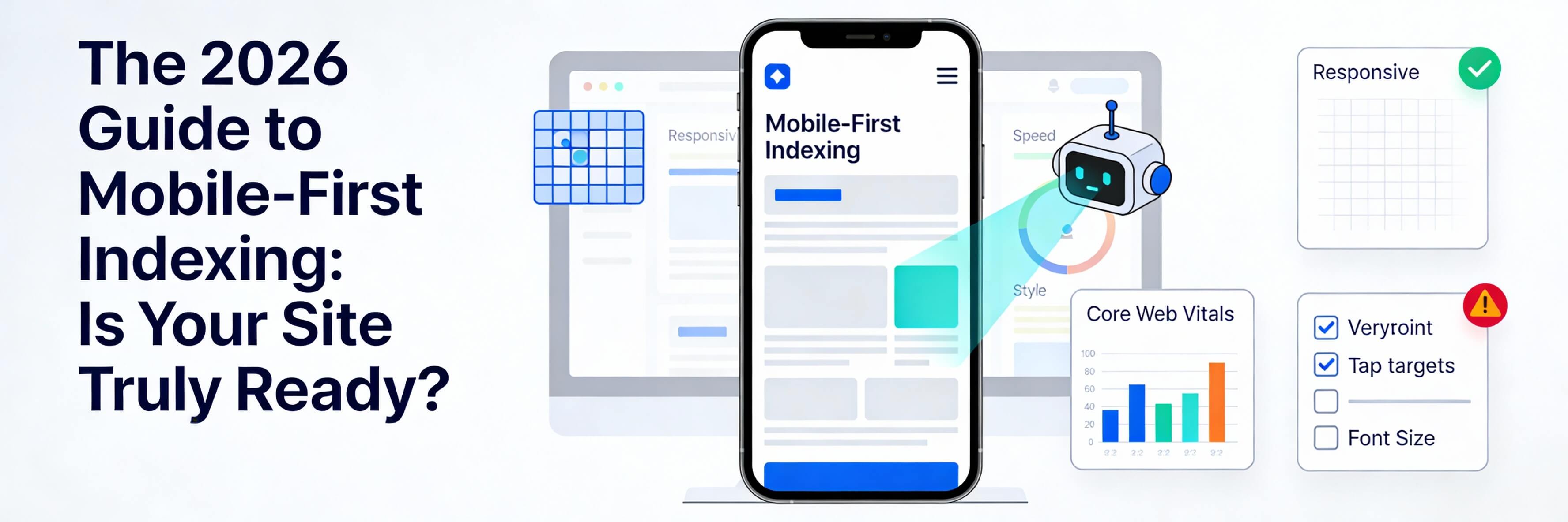
Mobile is No Longer the "Second Screen"
In 2026, mobile-first indexing is the only indexing that matters. Google no longer looks at your desktop site to determine your rank; it exclusively uses the mobile version of your pages to understand your content and authority. If your mobile site is a "lite" version of your desktop site with less content, you are likely fixing poor seo optimization on the wrong platform. This guide explains the technical adjustments needed to ensure your site is truly mobile-ready for the current search landscape.
1. Parity: The Golden Rule of Mobile-First
Content parity means that your mobile site must have the same high-quality content as your desktop site. If you hide text or images on mobile to save space, Google may stop ranking you for those terms.
- Don''t Hide Content: Avoid using "display:none" for major text blocks on mobile. If you must save space, use accordions or tabs, which are now fully crawlable.
- Equal Metadata: Ensure your mobile pages have the same SEO titles and meta descriptions as desktop.
- Structured Data: Your schema markup must be present on both versions of the site.
2. Optimizing for Mobile Crawl Budgets
Mobile-first indexing means Googlebot-Mobile is visiting your site more frequently. If your site is technically inefficient, the bot will waste its "crawl budget" on junk instead of your important pages.
- Fix Redirect Loops: Ensure you don''t have unnecessary redirects that slow down the bot.
- Clean Your Robots.txt: Make sure you aren''t accidentally blocking the mobile crawler. Review the importance of robots txt for a safe setup.
- Server Reliability: If your server crashes when the bot visits, your rankings will drop instantly. Know how to fix website downtime to stay in the index.
3. Typography and Visual Scaling
With the rise of high-resolution displays in 2026, "readable" text is a major UX and SEO signal. If a user has to pinch-to-zoom, Google will penalize your mobile usability score.
- Font Scaling: Use relative units like
remoreminstead of fixed pixels (px) to ensure text scales beautifully across devices. - Touch Targets: Ensure buttons and links are at least 48x48 pixels. This prevents the "fat finger" error, a common part of fixing poor mobile responsiveness.
- Optimized Media: Use responsive images that serve smaller file sizes to mobile users. Learn how to optimize website images properly.
4. Mobile Speed and Core Web Vitals
On mobile, every millisecond counts. In 2026, mobile speed is a direct factor for appearing in Google AI Overviews.
- LCP (Largest Contentful Paint): Your mobile hero image must load fast. If it''s sluggish, you need to speed up your site.
- Interactivity (INP): Ensure your site responds immediately when a mobile user taps a button.
- Database Health: A bloated database slows down your mobile load times. Follow our database cleanup guide to stay lean.
5. Monitoring Your Mobile Health
You can''t fix what you don''t measure. Use technical tools to see your site exactly as Googlebot-Mobile sees it.
- Search Console: Regularly check the "Mobile Usability" report. If you see errors, you may need to fix page not indexed issues.
- Weekly Audits: Make mobile testing part of your 10-minute weekly website health check.
- Internal Link Health: Ensure mobile navigation doesn''t lead to dead ends. Identify and fix broken internal links to keep the mobile crawl smooth.
Mobile-first indexing is the standard for the modern web. By ensuring content parity, optimizing your crawl budget, and focusing on mobile-specific UX, you protect your rankings and provide a better experience for the majority of your users. If you are unsure if your site is truly mobile-ready, WebCare SG can perform a comprehensive mobile-first audit and performance overhaul. Contact us today to secure your mobile future.