When you visit a website and struggle to read the text because the colors blend together too much, you are experiencing poor color contrast. For Singapore business owners, this is not just an aesthetic issue — it is a real problem that can drive away potential customers, damage your brand reputation, and even put you on the wrong side of accessibility laws. Whether you run an e-commerce store in Jurong, a law firm in the CBD, or a dental clinic in Tampines, if your website uses colors that are hard to read, you are likely losing customers without even knowing it.
Color contrast refers to the difference in luminance between foreground text and its background. When that difference is too small, people with visual impairments, older users, or anyone viewing your site in bright sunlight cannot read your content easily. In Singapore, where we spend hours on our phones and tablets under harsh overhead lights or glaring sun, poor contrast is especially punishing. A 2024 survey by the Info-communications Media Development Authority found that nearly 18% of Singaporeans reported difficulty reading websites due to poor text visibility — that is roughly 1 million people. If your website fails even a basic contrast check, you are effectively closing your doors to a significant portion of your potential market.
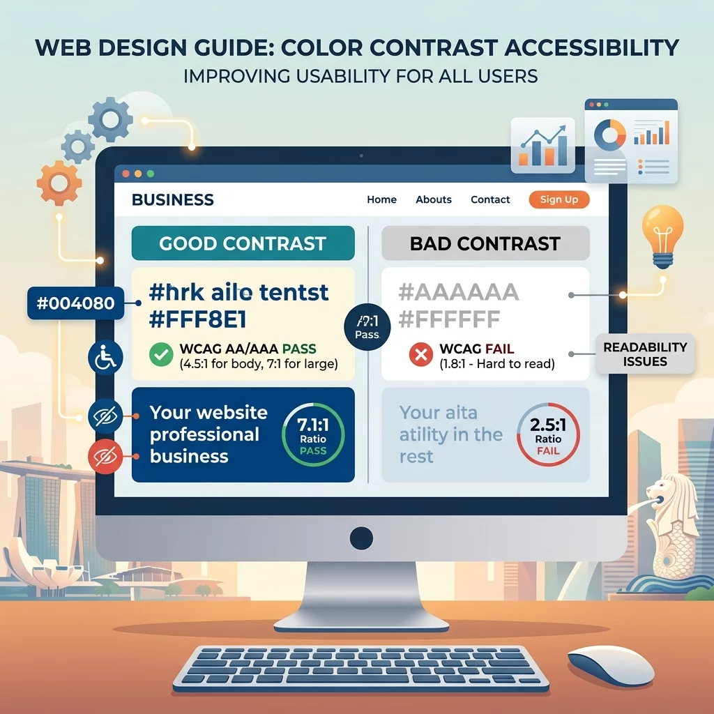
Beyond the business case, there is also a legal dimension to consider. Singapore adopted the Web Content Accessibility Guidelines 2.1 (WCAG 2.1) as part of its Smart Nation initiative, and while there is no enforcement arm equivalent to the US ADA lawsuits, government guidelines increasingly expect websites to meet AA-level contrast standards. If you are bidding for government contracts or serving public-sector clients, accessibility compliance is becoming a de facto requirement. Even if you are not, the international standard for accessible design is WCAG 2.1 Level AA, which mandates a minimum contrast ratio of 4.5:1 for normal text and 3:1 for large text.
In this guide, I will walk you through exactly what color contrast means, which tools you can use to check your website right now, and step-by-step instructions to fix the issues you find. You do not need to be a designer or a developer. If you can log into your website admin panel and change a color value, you can do everything in this guide.
Understanding Color Contrast Ratios
Before we dive into tools and fixes, let us understand what contrast ratios actually mean. A contrast ratio is expressed as a number like 4.5:1 or 7:1. The first number represents the luminance of the lighter color, and the second represents the luminance of the darker color. A ratio of 1:1 means the two colors are identical — completely unreadable. A ratio of 21:1 is the maximum possible contrast (black on white).
Here is the scale you need to know as a Singapore business owner:
- 4.5:1 or higher — This is the WCAG AA standard for normal text under 18 points (or 14 points if bold). Your body text and most headings need to meet this.
- 3:1 or higher — This is the WCAG AA standard for large text (18 points or larger, or 14 points bold). Section headers and callout text can use this lower ratio.
- 7:1 or higher — This is the WCAG AAA standard, the highest level of accessibility. Aim for this on your most critical text like your phone number, emergency notices, or key calls to action.
- Below 3:1 — This fails WCAG requirements entirely. If your text falls into this range, you need to fix it immediately.
Think of it this way. If you are using light gray text on a white background, you might have a ratio of 2:1 or lower. That is like trying to read a newspaper in dim light — technically possible but unnecessarily difficult. By increasing the darkness of the gray or the background color, you can push that ratio up to 4.5:1 or beyond, making your content accessible to nearly everyone.
Step 1: Check Your Website Using Free Tools
The first thing you need to do is find out where your website stands right now. You do not need to hire an accessibility consultant. Several free tools can give you an immediate answer in under five minutes.
Tool 1: WebAIM Contrast Checker (webaim.org/resources/contrastchecker)
This is the most straightforward tool for beginners. Go to that URL and you will see two color fields — one for your foreground color (your text) and one for your background color. Enter the hex color codes from your website. If you do not know your hex codes, you can use a free browser extension like ColorZilla to click on any element on your page and copy its color code.
Once you enter both colors, the tool instantly shows you the contrast ratio and whether it passes or fails WCAG AA and AAA levels. It also shows you what the combination looks like visually so you can see for yourself if it is readable.
Tool 2: APCA Calculator (www.myndex.com/APCA/)
APCA is a newer contrast method that is gradually replacing the older WCAG ratio system in many design tools. It is more context-aware and considers how we actually read on screens. For most Singapore business websites, the standard WCAG AA check is still the baseline you should meet, but APCA is worth knowing about if you are working with a designer who is ahead of the curve.
Tool 3: Browser DevTools
If you use Google Chrome or Microsoft Edge, you can check contrast directly while browsing any page. Press F12 to open Developer Tools, click on the Elements tab, and select any text element on the page. In the Styles panel, you will see the color property. Next to the color square, Chrome now shows a contrast ratio and a small pass/fail indicator. This is incredibly useful for auditing your own pages without installing anything.
For Safari users on Mac, you can enable the Accessibility inspector under Developer > Inspect > Accessibility. This gives similar information for any element on the page.
Step 2: Find All Problem Areas on Your Website
Checking one page is not enough. You need to audit your entire website because different sections may have been built at different times by different people. Here is a systematic approach to find all contrast problems.
Create a page inventory. List all the main types of pages on your site: homepage, about us, service pages, blog posts, contact form, product pages if applicable. You do not need to check every single page — instead, check one representative page of each type.
Check each page template. For WordPress users, your theme likely has a handful of templates: default page, blog listing, single post, sidebar, footer. Test each one because they often use different color combinations. If you use Wix, Squarespace, or Shopify, look at the different section types you use — hero banners, text blocks, buttons, footers.
Document what you find. Use a simple spreadsheet with three columns: page URL, problem element (e.g., "body text on white background"), current colors, and current ratio. This documentation is valuable because it helps you communicate with your web developer or designer if you need help with fixes.
Pay special attention to: buttons and call-to-action elements (often overlooked), footer text (sometimes lighter than body text), form field labels, placeholder text in input fields, and any text overlaid on images or colored backgrounds.
Step 3: Fixing Contrast Problems in Common Website Platforms
Once you have identified the problems, here is how to fix them on the most common platforms Singapore business owners use.
WordPress
If your site uses a page builder like Elementor, Divi, or the default WordPress editor, you can usually change text colors in the visual editor. In Elementor, select any text block, go to the Style tab, and look for Text Color. In Divi, open the module settings and find the Advanced Design Settings. In the default WordPress block editor, highlight text, click the color picker in the block toolbar, and select your new color.
For your theme-level colors (which affect all pages unless overridden), go to Appearance > Customize and look for Colors or Typography settings. Many modern WordPress themes have a Global Colors section where you can set your primary text color, background color, and link colors in one place.
Wix
In Wix Editor, click on any text element, then click the Paint Brush icon to open style settings. You can change text color directly there. For site-wide color changes, go to Site > Edit Site Colors to modify the default palette. Wix also has a theme store where many themes are pre-built with accessible contrast ratios — if you are rebuilding anyway, choosing a well-designed theme can save you significant effort.
Squarespace
Squarespace uses a Style Editor panel accessible via Design > Site Styles. Click on any element type (Body, Heading, Button, etc.) and you will see color controls. For more granular control, Squarespace allows custom CSS — go to Design > Custom CSS and you can override any color on the site. For example, to change all body text to a darker shade of gray, you might add: body { color: #2d2d2d; }
Shopify
In your Shopify admin, go to Online Store > Themes > Customize. Click on Theme Settings and you will find color controls for different elements. For more complex changes, Shopify also supports custom CSS through the same Theme Editor > Custom CSS panel.
Step 4: Handling Text Over Images and Colored Backgrounds
One of the trickiest contrast situations is text placed over a photo or a colored background. This is common in hero sections and banner images. Here is the systematic approach to make this work.
Option A: Add a dark overlay. Place a semi-transparent black or dark colored rectangle behind your text. An overlay with 50% to 70% opacity typically gives you enough contrast with white text. Most website builders let you add a shape layer behind your text for this purpose. The formula is: if your overlay is at #000000 at 60% opacity, it creates a background luminance dark enough for white text to pass 4.5:1.
Option B: Use a text shadow or outline. If you cannot add an overlay (for example, in a responsive hero where the background image changes), you can add a text shadow to improve legibility. A shadow of 2px to 4px with slight blur can create enough visual separation. However, this is a compromise solution — text shadows do not technically satisfy WCAG requirements if the underlying image fails contrast on its own. Use this as a temporary measure while you arrange for a proper overlay.
Option C: Use a contrasting text box. Instead of placing text directly on the image, place your text inside a semi-opaque or solid colored box. The box provides the contrast background, and the image shows through around the edges for visual appeal. This is a very reliable approach and is commonly used in professional web design.
Option D: Choose a very light or very dark image area. If your background image has areas that are very light (almost white) or very dark (almost black), you can position your text over those neutral zones and achieve good contrast without any overlay. This requires choosing and positioning carefully, and it can break on mobile devices where images are cropped differently.
Step 5: Testing Your Fixes and Validating Against WCAG Standards
After making changes, you need to verify that your fixes actually work. Here is the testing workflow.
Re-check with your contrast tool. Go back to the WebAIM Contrast Checker and enter the new color values. Confirm that you are hitting at least 4.5:1 for body text.
Test on actual devices. Do not rely solely on digital tools. Open your website on your own phone, tablet, and desktop. Try viewing it in different lighting conditions — in a bright office, in a dim meeting room, outdoors on a sunny day. Real-world testing reveals issues that tools cannot simulate, like screen glare that kills contrast on certain color combinations.
Ask a colleague to read it. Find someone over 50 and ask them to read your contact page, pricing page, or any text-heavy section. Their feedback will be immediately actionable and much more valuable than a tool score. If they struggle, that is a problem you need to solve.
Use an automated accessibility scanner. After individual fixes, run a full-page scan using tools like axe DevTools (a free Chrome extension) or Lighthouse in Chrome DevTools. These tools check not just contrast but a range of accessibility issues and give you a detailed report in minutes.
Step 6: Setting Up Ongoing Contrast Monitoring
Fixing contrast once is not enough. As you add new pages, change images, or update your theme, new contrast problems can creep in. Here is how to prevent that.
Create a color palette document. Write down your approved color combinations — your body text color, your background color, your link color, your button text color, your button background color. Include the hex codes. Share this document with anyone who adds content to your website, whether they are an employee, a contractor, or a content writer. A clear reference prevents well-meaning people from introducing hard-to-read colors.
Add contrast checking to your publishing workflow. Before any new page goes live, have whoever is responsible do a quick contrast check on the key text elements. This takes two minutes with the WebAIM tool but prevents problems from reaching the public.
Schedule a quarterly review. Put a recurring calendar event to re-audit your main pages every three months. Website updates, new plugins, theme updates, and new content can all introduce contrast problems. A quarterly check keeps your site in good shape.
Monitor your Google Search Console. If you use Google Search Console, pay attention to any Core Web Vitals or usability alerts. While contrast is not directly measured in Core Web Vitals, overall usability issues often correlate with accessibility problems that affect real users.
Step 7: When to Get Professional Help
There are situations where a business owner should step back and bring in a professional. You should consider hiring a web developer or accessibility consultant if:
- You have more than 20 pages with contrast issues and limited time to fix them manually.
- Your website uses custom code or a highly customized theme where you cannot easily change colors through the admin panel.
- You are redesigning your website anyway — it makes financial sense to build accessibility in from the start rather than retrofitting.
- You receive complaints from users about readability and cannot identify the cause.
- You operate in a regulated industry where accessibility documentation may be required for compliance purposes.
A competent freelance web developer in Singapore can fix contrast issues across an entire website in a few hours to a day, depending on the platform and the extent of the problems. You can find qualified developers on platforms like Fiverr, Upwork, or through the SG Web Professionals community on LinkedIn. When contacting developers, specifically ask about their experience with WCAG 2.1 accessibility standards.
If you still need help, feel free to contact us at https://webcare.sg/contact for a free website health check.