How to Fix Poor Website Navigation Before It Drives Customers Away
You have spent money on ads, social media posts, and reviews to get people to visit your website. But then something goes wrong. Visitors land on your page, look around for a few seconds, and leave. No enquiry. No purchase. No follow-up. If this sounds familiar, the culprit might be hiding in plain sight: your website navigation.
Navigation is the map that guides visitors through your website. When it works well, people find what they need and become customers. When it fails, even interested buyers give up and go somewhere else. For Singapore small business owners, this is especially painful because every bounced visitor represents a potential lead that you worked hard to attract.
The good news is that navigation problems are among the easiest website issues to fix, even if you have no technical background. In this guide, you will learn how to spot navigation problems, understand why they hurt your business, and apply practical fixes that make your site easier to use. You will also learn when it makes sense to call in professional help, and how WebCareSG can step in to handle the technical work for you.
Why Navigation Matters More Than You Think
Before we get into the how-to, let us cover the why. Many business owners treat navigation as an afterthought, something that gets sorted out after the design is done. That is a mistake. Navigation directly affects how long people stay on your site, how many pages they view, and whether they complete the actions you want them to take.
Think about the last time you visited a website and could not find what you were looking for. Maybe the menu was hidden, or the labels were confusing, or the important page was buried three levels deep. You probably left within seconds and found a competitor instead. Your customers do the same thing. The difference is that they do not tell you they left because they could not find the checkout button. They simply vanish.
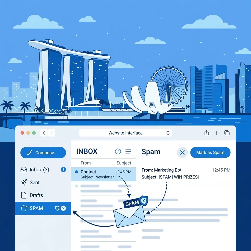
Poor navigation also hurts your search engine rankings. Google watches how people interact with your site. If visitors leave quickly, search engines take that as a signal that your page did not answer their question. Over time, this can push your site down in search results, making it even harder for new customers to find you. This is why fixing navigation problems often gives your SEO a quick boost alongside the usability improvements.
Step 1: Identify the Navigation Problems on Your Website
Before fixing anything, you need to know what is broken. Walk through your own website with fresh eyes. Pretend you are a customer who has never heard of your business. Ask yourself these questions:
- Can I find the main menu within two seconds of landing on any page?
- Do the menu labels use words my customers would actually use?
- Is there a clear path to the most important pages, like services, pricing, and contact?
- Can I get back to the homepage from anywhere on the site?
- Does the website work well on a mobile phone, not just on a computer?
If you found yourself hesitating or getting lost at any point, that is a navigation problem. Write down exactly what went wrong so you have a clear to-do list for the next steps. It helps to ask a friend or colleague to try finding specific information on your site while you watch. Their struggles will highlight problems you might have overlooked because you are too familiar with your own structure.
Google Analytics is another useful tool for spotting navigation issues. Log in to your account and look at the Bounce Rate and Exit Pages reports. Pages with unusually high bounce rates often have navigation or content problems. Pages where people frequently exit are clues that something is blocking the next step in your funnel.
Step 2: Simplify Your Menu Structure
One of the most common navigation mistakes is trying to show everything in the main menu. Business owners want to make sure every page is accessible, so they pack the navigation bar with dozens of items. The result is a cluttered menu that overwhelms visitors and makes it harder to find anything useful.
The fix is simple: limit your main menu to five to seven items. Focus on the pages that matter most to your business goals. For most Singapore small businesses, those pages are Home, Services or Products, About Us, and Contact. If you have more categories than that, group the related items under a single menu heading. For example, instead of listing Blog, News, and Events as separate menu items, create one dropdown called Insights or Resources and group them together.
When naming your menu items, think about the words your customers would use. A plumbing company might call their service "Drain Cleaning" because that is what customers search for, even if the internal page name is "Residential Drainage Solutions." Using familiar language reduces confusion and helps visitors feel confident they are in the right place.
Step 3: Make Your Most Important Pages Easy to Reach
Every website has pages that matter more than others. For a service business, that is usually the contact page, the service listing, and the booking page. For an e-commerce site, the product pages and checkout are critical. Your navigation should make these high-value pages one click away from anywhere on your site.
One effective technique is to add a sticky header that stays visible as people scroll down the page. This keeps your menu and contact information always within reach. Another technique is to include Calls to Action in unexpected places. For example, a "Contact Us" button at the end of a service description keeps the next step visible even after a long block of text.
Your homepage should also serve as a navigation hub. Think of it as a landing page that directs visitors deeper into your site. Include clear links to your main services, recent content, and customer testimonials. The easier it is to move from the homepage to a decision point, the more likely visitors are to take action.
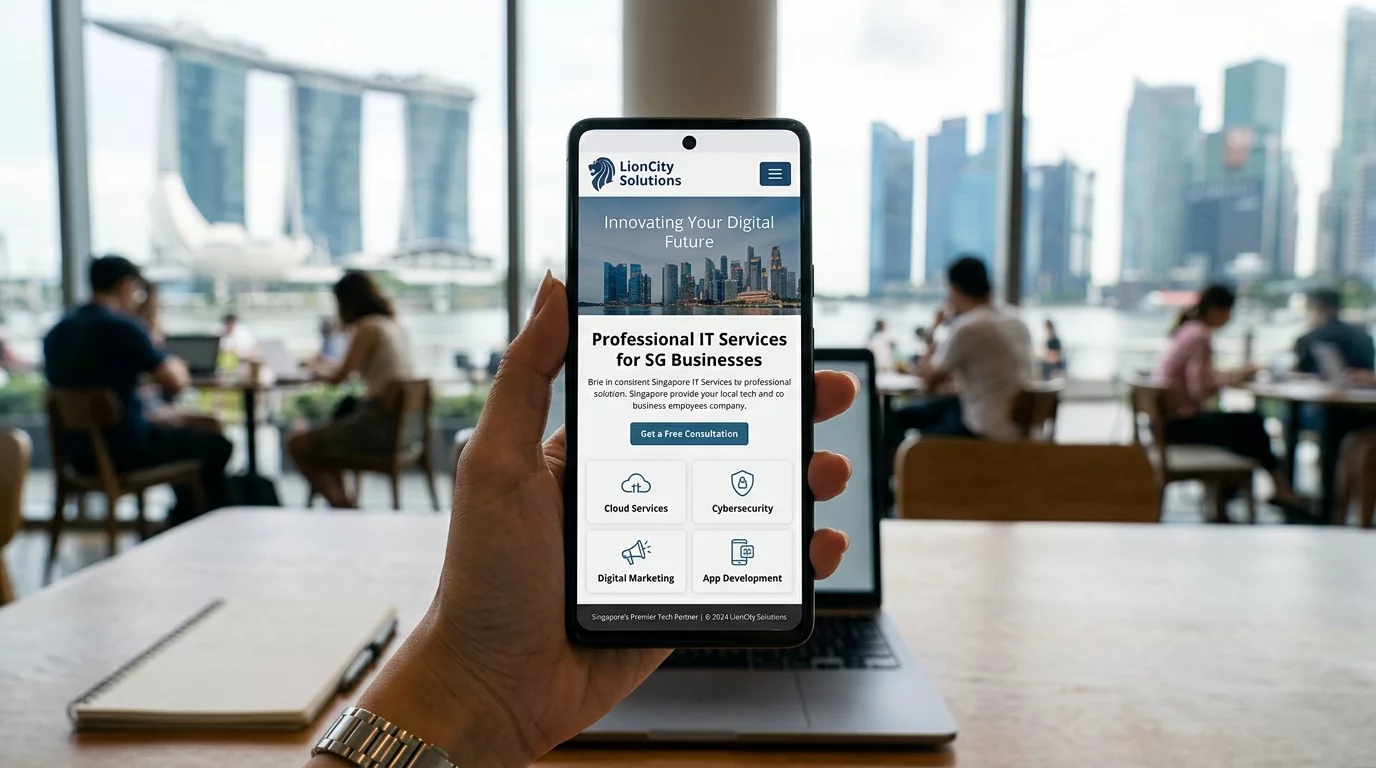
Step 4: Optimize for Mobile Users
More than half of all web traffic in Singapore comes from mobile devices. If your website navigation does not work well on phones, you are probably losing the majority of your potential customers. Mobile navigation has its own rules because screen space is limited and people interact with touch screens differently than with a mouse.
The first rule of mobile navigation is to keep it simple. A hamburger menu (the three-line icon that expands when tapped) works well for organizing secondary links without cluttering the screen. Make sure the tap targets are large enough. Buttons and links should be at least 48 pixels wide so that people with larger fingers can tap them accurately.
One common mistake is hiding critical actions inside menus that require too many taps. Your phone number, email address, and booking button should be visible without opening any menu. If customers have to dig through multiple layers just to find your contact details, they will give up and call someone else instead.
If you want to see exactly how mobile-friendly your site is, try browsing it on your own phone. Better yet, ask a friend who has never seen your website to try completing a task like booking an appointment or finding your address. Their experience will tell you everything you need to know about mobile usability.
Step 5: Add Internal Links to Guide Visitors
Navigation is not just about the menu. Internal links throughout your content act as signposts that guide visitors to the next step. When you mention a related service or product in your content, link to the relevant page. This keeps people moving through your site instead of hitting dead ends.
Effective internal linking follows a logical pattern. If you write a blog post about common plumbing problems, link to your drain cleaning service page at the end. If you have a case study showing how you solved a client's problem, link to the relevant service and include a call to action. Each link should feel natural and helpful, not forced.
One useful habit is to end every page with a clear next step. Whether it is a link to a related service, a suggestion to read another article, or a direct invitation to get in touch, ending with direction prevents people from getting stuck at a dead end. Our guide on UX myths covers more ways to guide visitors toward conversion without making navigation feel pushy.
Step 6: Test and Refine Your Navigation Regularly
Fixing navigation is not a one-time task. As your business grows and your website content changes, your navigation needs to evolve too. Set a reminder to review your navigation every few months. Check whether all menu links still work, whether the most important pages are still easy to find, and whether new content has created confusing overlaps.
Heatmap tools like Hotjar or Microsoft Clarity can show you exactly where people click and scroll on your site. If you see that visitors are clicking on things that are not links, it means they expect something to be clickable that is not. This is a valuable signal that your design does not match visitor expectations.
Collecting feedback is also important. Add a simple feedback widget or send a short survey to customers asking how easy it was to find information on your website. Direct feedback from real users highlights problems that analytics tools might miss. Even a single comment like "I could not find the booking page" is worth investigating.
When to Call in Professional Help
Do-it-yourself fixes work well for straightforward navigation problems. However, some issues require deeper technical changes that are not suitable for beginners. If your website is built on a complex platform, or if navigation problems stem from underlying code issues, you risk making things worse by experimenting on your own.
Warning signs that you need professional help include broken links that do not respond to easy fixes, menu structures that cannot be changed through your website editor, mobile layout problems that persist across different devices, and navigation that works fine on desktop but falls apart on phones. These issues often point to deeper problems in your website code or hosting configuration.
It is also worth calling in help when you have made several navigation fixes but have not seen improvement in your bounce rate or conversion numbers. A professional can audit the full user journey and identify bottlenecks that you might have missed. Sometimes the problem is not navigation at all but something else entirely, like slow page loading or confusing content.
Common Navigation Mistakes Singapore Business Owners Make
To help you avoid the most common pitfalls, here is a list of mistakes we see frequently when auditing Singapore business websites:
- Using jargon in menu labels: Technical terms or company-specific names confuse visitors. Stick to plain language your customers would use.
- Including too many menu items: A crowded menu is hard to scan. Focus on the five to seven most important pages.
- Hiding the contact page: Make your contact information impossible to miss. It should be reachable in one click from any page.
- Forgetting the mobile experience: Test your menu on a phone. If it requires pinching, zooming, or excessive scrolling, fix it.
- Using auto-playing media: Videos or sounds that start automatically interrupt navigation and frustrate visitors.
- Not providing a search function: If you have a lot of content, a search bar helps visitors find specific information quickly.
- Having orphaned pages: Every page should be reachable through some link. Pages that exist but have no paths to them are dead ends.
Going through this checklist regularly keeps your website visitor-friendly and reduces the risk of losing potential customers to confusing navigation.
Final Thoughts: Navigation Sets the Stage for Customer Experience
Your website navigation is the foundation of every visitor's experience on your site. When it works well, people find what they need, trust your business, and take the next step toward becoming a customer. When it fails, even the best products and services go unnoticed because people cannot find them.
Taking the time to audit and fix your navigation is one of the highest-return activities you can do for your website. It costs nothing to change a menu label or reorganize your pages, but the impact on visitor satisfaction and conversion rates can be significant.
If you have worked through the steps in this guide and still feel uncertain, or if you have discovered technical problems that are beyond your comfort level, reach out to the team at WebCareSG. We specialize in fixing website problems for Singapore business owners, and navigation issues are among the most common problems we solve. Contact WebCareSG today and let us help you turn your website into a customer-generating machine.
Related WebCare Solutions
How to Fix Poor Mobile Responsiveness and Keep Users Engaged!
More than 70% of your visitors are on their phones. If your website looks broken on mobile, they will leave and never come back. Here is how to fix it step by step.

Why is My Website’s Layout Broken? How to Fix CSS Issues
Learn how to identify and resolve common CSS conflicts and coding errors that can cause your website layout to break.

Why Is My Website Footer Important? A Singapore Business Owner's Guide
A website footer is more than just the bottom of a page. Learn why it matters for your Singapore business website and how to optimise it step by step.
Ready to get started?
Focus on your business while we fix your website. Contact WebCareSG today for fast, reliable solutions!
Whatsapp us on