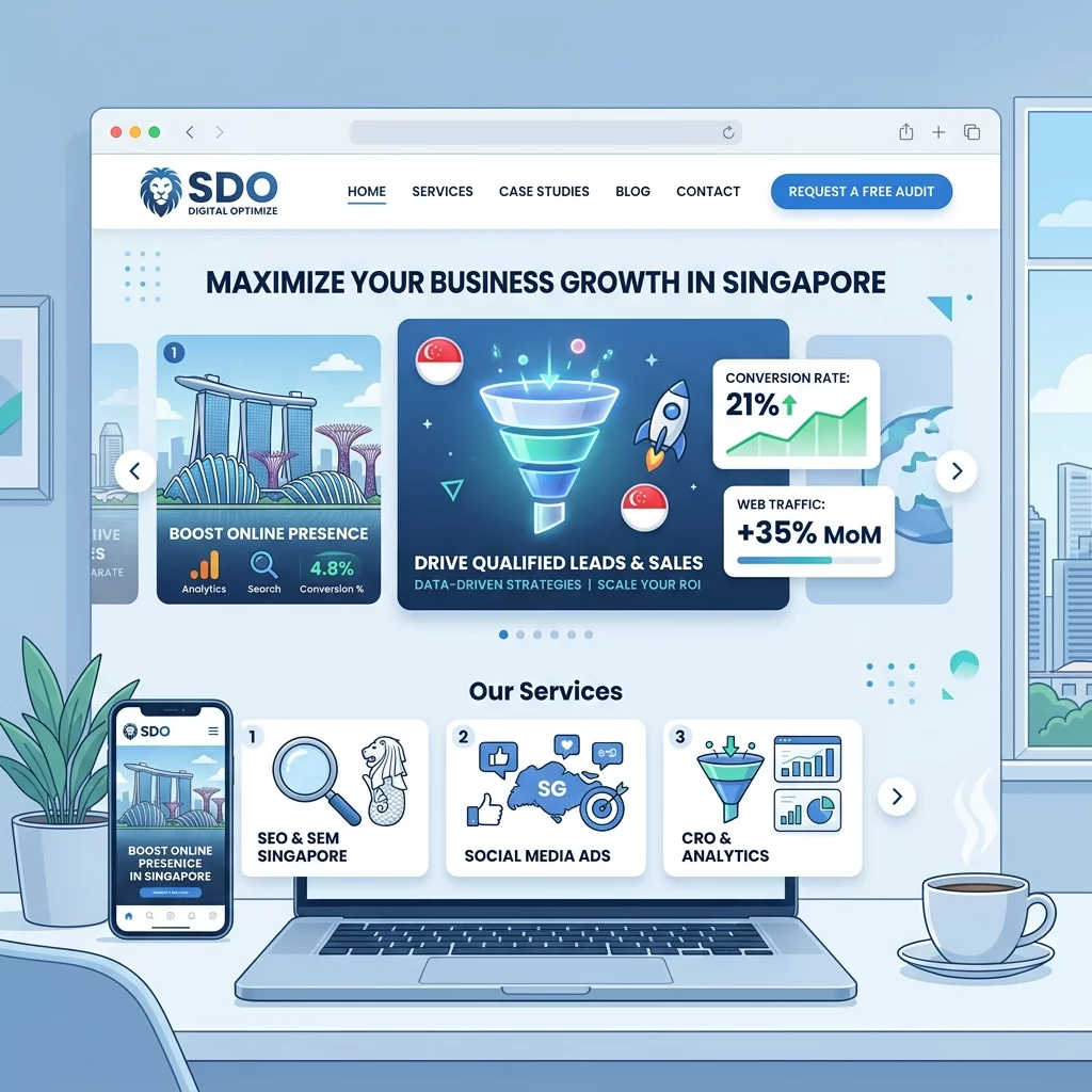
You have probably seen them on countless websites: big, rotating image sliders at the top of a webpage that automatically cycle through promotional messages, product images, or featured content. These image carousels have been a staple of website design for over ten years. Many Singapore business owners added them hoping to showcase multiple products or offers in a limited space. But here is the uncomfortable truth that many website designers will not tell you: image carousels often hurt your website's performance more than they help it.
Research from multiple usability studies has consistently shown that website visitors tend to ignore carousels. When a page loads with an automatic slider, most people are already scanning for the information they came for. They do not wait for the rotation to complete. In fact, studies have found that the first slide in a carousel gets the vast majority of the clicks, sometimes over ninety percent, while subsequent slides go mostly unseen. This means you could be paying to display three or four promotional messages, but your visitors are only seeing one. For a small business in Singapore trying to make every marketing dollar count, this is a significant problem.
The issue becomes even more pressing when you consider mobile browsing habits. Singapore has one of the highest smartphone penetration rates in the world. Most of your potential customers are viewing your website on their phones. Image carousels that work beautifully on desktop often become slow, janky, and confusing on mobile devices. They consume precious screen space, load slowly on mobile data, and frequently cause layout shifts that frustrate users. Google also factors page speed and mobile usability into its ranking algorithm, so a poorly performing carousel could be quietly sabotaging your search engine visibility as well.
Before you rush to remove every slider from your website, however, you need to understand that carousels are not universally bad. There are specific situations where they can be effective, and there are also many better alternatives that most Singapore business owners should consider instead. This guide will walk you through everything you need to know to make an informed decision about whether to keep, fix, or replace your website's image carousels.
Understanding Why Image Carousels Often Fail
The first step to making the right decision is understanding why carousels underperform. The main problem is a concept that usability experts call banner blindness. Internet users have developed a mental filter that allows them to unconsciously skip over elements that look like advertisements or promotional banners. Since carousels typically sit prominently at the top of a page and contain rotating promotional content, visitors mentally categorize them as ads and ignore them automatically. This happens within milliseconds of the page loading, long before any animation has had a chance to capture their attention.
Another issue is user control. Traditional carousels force a pace on the visitor that they did not consent to. The slides rotate on a timer, and if someone is reading the first slide when the rotation happens, they lose their place. This creates a frustrating experience that drives visitors away. Users prefer to be in control of their browsing experience. When they have to wait for a slider to reach the information they want, or when they have to hunt for a tiny pause or navigation button, they often give up and leave.
Performance is a third critical factor that many business owners overlook. Each image in a carousel is an additional asset that the browser has to download. On a typical Singapore broadband connection this might not seem like a big deal, but for mobile users on the go, or for visitors accessing your site from more remote areas of Southeast Asia, these extra image loads can mean the difference between a page that loads in two seconds and one that takes eight or ten. Slow loading directly impacts your bounce rate, your Google ranking, and ultimately your bottom line.
When Image Carousels Can Still Work
Despite all the criticism, there are scenarios where a well-implemented carousel can serve a legitimate purpose. If your business genuinely needs to display multiple equally important pieces of information in a limited space, a carousel can be an acceptable solution. For example, an e-commerce website that sells luggage might use a carousel to show bags from different categories like business travel, outdoor adventure, and family vacation. If all three categories have roughly equal promotional value and change regularly, a carousel allows you to feature them without dedicating separate sections of your homepage to each one.
The key word here is equal importance. If one of your slides gets ninety percent of the clicks while the others are ignored, then those ignored slides are wasted space. But if your analytics show that users are engaging with multiple slides in your carousel, then at least for your specific audience and use case, the carousel may be working. This is why you should always check your actual data before making changes based on general advice. What works for one business may not work for yours, and vice versa.
Another situation where carousels can work is when they are used as navigation aids rather than promotional tools. A photo gallery carousel that lets users browse through product images without leaving the page is a legitimate interactive element. A carousel that lets users compare different product colors or angles serves a functional purpose. The difference is whether the carousel is helping users accomplish a task or just shouting marketing messages at them.
How to Check Your Own Carousel Performance
Before making any changes, you need to understand how your current carousel is performing. Here is how to check using Google Analytics, which most Singapore business owners with WordPress or Shopify websites should have set up already.
- Log into your Google Analytics account and navigate to the Behavior section.
- Open the Site Content menu and click on Landing Pages.
- Find the pages on your website that have carousels and click on them.
- Navigate to the Event category or use a custom report to track carousel interactions.
- Look at which slides are being clicked and how often. If the first slide accounts for the vast majority of clicks, your carousel is not working as intended.
If you do not have event tracking set up for your carousel, you can also look at the page's overall engagement metrics. A high bounce rate on pages with carousels could indicate that visitors are leaving before engaging with the content. A low average time on page might suggest that visitors are not reading the rotating messages because they keep changing before they finish reading.
Another useful method is to use a heatmap tool. Services like Hotjar or Microsoft Clarity allow you to see where users are clicking and scrolling on your pages. If you install a free heatmap on your homepage and discover that the carousel area receives very few clicks compared to other elements like your call-to-action buttons or product images, you have clear evidence that the carousel is not earning its keep.
Steps to Improve Carousel Effectiveness
If after reviewing your data you decide that you want to keep your carousel, here are the steps you should take to maximize its effectiveness. Follow these carefully, because even a good carousel can be ruined by poor implementation.
Step 1: Reduce the number of slides to three or fewer.
The most common mistake with carousels is trying to show too much. If you have five or six slides, you are asking visitors to wait too long to see the information they want. More slides also mean more images to load, which slows down your page. Cut your carousel down to the three most important messages. If you have more than three things to say, find a different place on your page to say them.
Step 2: Make the first slide the most important one.
Since the first slide gets the most views, put your most compelling and highest-priority message there. Do not waste the prime real estate of the first visible slide on a generic welcome message like "Welcome to Our Store." That slide should contain your strongest call to action, your most popular product, or your most urgent promotional offer.
Step 3: Disable automatic rotation.
Automatic rotation is one of the worst usability features you can enable. It forces content at a pace the user did not choose, it frustrates people who were in the middle of reading, and it does not improve engagement. Instead, let users control the carousel by clicking or swiping. If you must have automatic rotation for visual reasons, make the interval very long, at least ten to fifteen seconds, and give users an obvious pause button.
Step 4: Add clear and visible navigation indicators.
Users need to know how many slides exist and which one they are currently viewing. Add clear pagination dots or numbers below the carousel. Make these large enough to tap on mobile devices. The current slide should be visually distinct from the others. If your navigation indicators are too small to read or hidden in a corner, users will not bother interacting with them.
Step 5: Optimize your images for speed.
Every image in your carousel should be compressed and resized to the exact dimensions it will display at. Do not upload a two thousand pixel wide image and let the browser resize it down to six hundred pixels. Use modern formats like WebP when possible. Tools like TinyPNG or Squoosh can reduce your image file sizes by seventy percent or more without noticeable quality loss. Each carousel image should be no more than one hundred to one hundred fifty kilobytes.
Step 6: Test on mobile devices.
Singapore users are heavily mobile, so your carousel must work flawlessly on smartphones. Test your carousel on actual mobile devices, not just responsive design previews in your browser. Check that touch swiping works smoothly, that text remains readable on small screens, and that the carousel does not cause horizontal scrolling or layout shifts. If your carousel does not work well on mobile, remove it entirely rather than forcing mobile visitors to deal with a broken experience.
Better Alternatives to Image Carousels
For most Singapore business owners, the better choice is to replace carousels with static hero images or explore other design patterns that proven to work better for conversion. Here are the main alternatives to consider.
A single static hero image with a clear value proposition and call to action is almost always more effective than a rotating carousel. Instead of trying to say three things at once, say one thing powerfully. A hero image that showcases your best product with a compelling headline and a single call-to-action button will outperform a carousel in most tests. This approach loads faster, is easier to understand, and gives visitors exactly one thing to focus on.
If you have multiple products or offers to showcase, consider using a grid layout instead of a carousel. A row of three or four product cards with images, titles, and prices is easier to scan than a rotating slider. Users can see everything at a glance without having to click through multiple slides. Grid layouts also perform better on mobile devices because they naturally adapt to vertical scrolling rather than requiring horizontal swiping.
Feature sections with icons and short descriptions work well for service-based businesses. Instead of a carousel promoting different services, create a clean section with three or four service cards, each with an icon, a headline, and a brief description. This format is scannable, loads quickly, and clearly presents your offerings without forcing users into an interaction pattern they did not choose.
Video backgrounds should generally be avoided for the same reasons as carousels, but a carefully placed promotional video can be powerful if your product or service benefits from visual demonstration. If you choose to use a video, keep it short, mute it by default, and ensure it does not slow down your page load time significantly.
How to Remove or Replace a Carousel
Once you have decided to remove or replace your carousel, here is how to do it safely without breaking your website. Always backup your website before making any design changes, no matter how minor they seem.
Step 1: Backup your website.
Use your hosting provider's backup feature or a plugin like UpdraftPlus for WordPress to create a complete backup of your site. Store the backup in a location separate from your server. This ensures you can restore your site if anything goes wrong during the modification process.
Step 2: Identify where the carousel code is located.
In WordPress, carousels are typically controlled by your theme or a specific plugin. Check your theme settings page for carousel options. If you are using a page builder like Elementor or Divi, the carousel element will be in the widget or section settings. In Shopify, carousels are usually part of the theme's homepage template settings. Look for sections called Hero Slider, Featured Content Slider, or Image Carousel.
Step 3: Disable or remove the carousel.
In most cases, you can simply disable the carousel in your theme or page builder settings rather than deleting the code. Look for an option to set the number of slides to zero, or to use a static image instead. In WordPress page builders, you can often replace a carousel section with a static image section by deleting the carousel widget and adding a new image widget.
Step 4: Add your replacement content.
Once the carousel is removed, add your chosen replacement. Upload a high-quality static hero image or create a grid section for your products. Make sure the replacement content is properly aligned with your brand and optimized for both desktop and mobile viewing.
Step 5: Test thoroughly across devices.
After making changes, test your website on multiple devices and browsers. Check that the page loads correctly, that all links work, and that the layout looks good on phones, tablets, and desktop computers. Ask a few colleagues or friends to test the site and provide feedback on whether the new design is easier to understand and navigate.
Step 6: Monitor your metrics after the change.
Give your new design at least two to four weeks before drawing conclusions. Compare your bounce rate, average time on page, and conversion rate to the period when you had the carousel. If the new design performs better, you have confirmed that the carousel was indeed holding your website back. If performance stays the same or gets worse, consider testing a different alternative or adjusting your implementation.
Making these changes can feel intimidating if you are not comfortable with website management, but the potential rewards in terms of better user engagement and higher conversion rates make it worthwhile. Your website visitors will thank you for giving them a clearer, faster, and more respectful browsing experience.
If you still need help, feel free to contact us at https://webcare.sg/contact for a free website health check.