More Than Just Aesthetics
Color is the first thing a user perceives when landing on your website, often before they read a single word. In web design, color psychology is the study of how hues influence human behavior and decision-making. Choosing the wrong palette can lead to high bounce rates, which might be mistaken for poor seo optimization. In the Singaporean market, where cultural context matters, understanding the emotional impact of color is vital for conversions.
The Emotional Weight of Core Colors
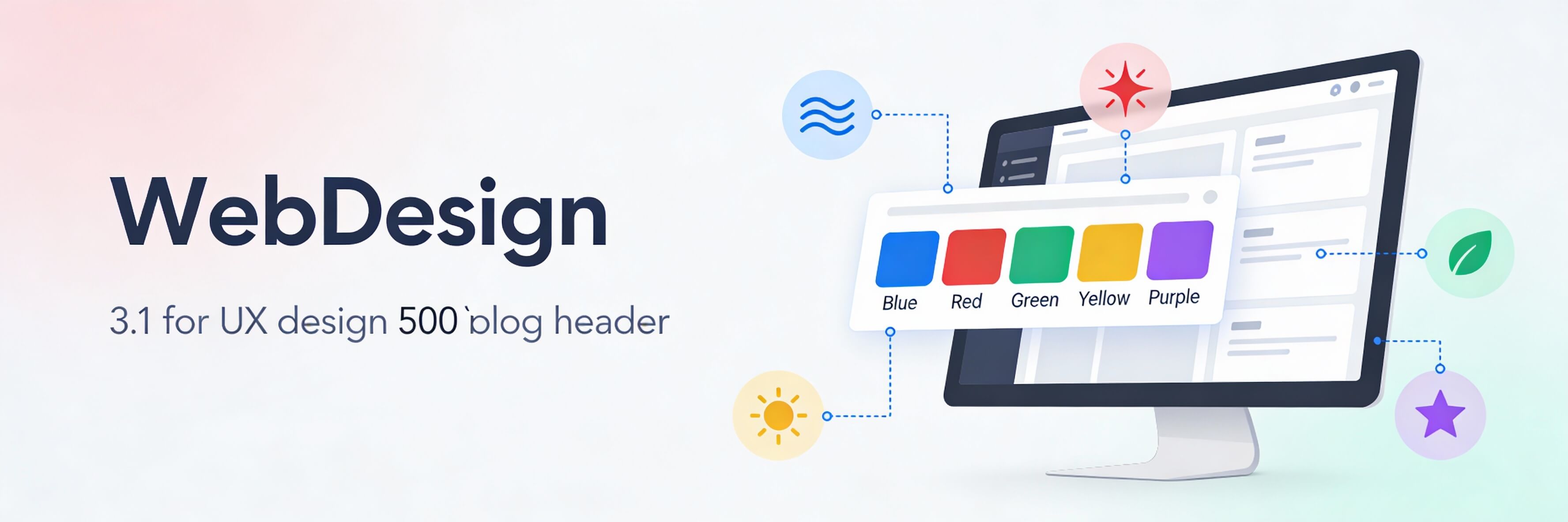
Different colors trigger specific psychological responses. Selecting the right primary color for your brand depends on the action you want your users to take.
- Blue (Trust and Security): The most popular choice for banks and tech companies in Singapore. It conveys stability and professionalism.
- Red (Urgency and Excitement): Often used for clearance sales or food delivery apps. However, excessive red can cause "visual fatigue."
- Green (Growth and Health): Associated with sustainability and wellness. This is a top choice for brands following sustainable web practices.
- Black/Gold (Luxury and Sophistication): Frequently used by high-end real estate and jewelry brands in the CBD.
The 60-30-10 Rule for Web Palettes
To create a balanced and professional look, designers often follow the 60-30-10 rule. This ensures your site isn''t overwhelming and remains accessible.
- 60% Primary Color: Usually a neutral color (white, light grey, or a dark shade) used for the overall background.
- 30% Secondary Color: Used for headers, sidebars, and sub-sections to create contrast.
- 10% Accent Color: Reserved for your most important elements, like Call to Action (CTA) buttons. A high-contrast accent color helps micro-copy stand out.
Color and Accessibility (WCAG Standards)
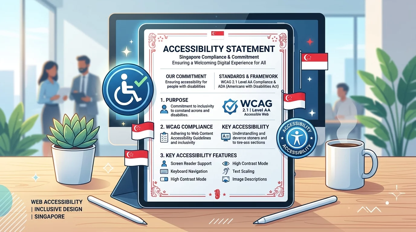
A beautiful color palette is useless if your text is unreadable. Accessibility is a key part of modern web standards and even influences how AI search engines perceive your site quality.
- Contrast Ratios: Ensure there is enough contrast between text and background colors. Low contrast is a common reason for poor mobile responsiveness.
- Color Blindness: Avoid relying solely on color to convey meaning (e.g., using only red to signal an error in a form).
- Dark Mode: Consider how your palette looks in dark mode. This is a growing trend in 2026 web design.
Testing Your Palette for Conversions
Color choices should be backed by data. What works for a boutique in Haj Lane might not work for a B2B consultancy in Raffles Place.
- A/B Testing: Test different button colors (e.g., Green vs. Orange) to see which yields a higher click-through rate.
- Heatmap Analysis: See if your accent colors are drawing attention where you want it. If not, you may need to conduct a website audit.
- Performance Check: Heavy use of complex gradients can sometimes impact rendering speed. Always speed up your site by using CSS instead of large background images.
Maintaining Visual Health
Consistency across your pages builds brand authority. Ensure that your brand colors are correctly applied to all new landing pages and blog posts.
- Check for Consistency: Inconsistent colors can be one of the 5 signs website needs maintenance.
- Weekly Review: Add a visual check to your weekly website health check.
- Avoid Over-Saturation: If your site feels too "busy," it might increase your bounce rate. Learn to reduce bounce rate through cleaner design.
The psychology of color is a powerful tool for influencing user emotions and driving conversions. By selecting a palette that balances cultural context with technical accessibility, you create a more effective digital presence. If you are unsure if your current colors are helping or hurting your sales, WebCare SG can provide a professional design and UX audit. Contact us today to revitalize your brand identity.