Picture this: you are a Singaporean business owner who has just spent thousands of dollars on a beautiful new website. The design looks stunning on your desktop computer. But when you check it on your phone one day, you notice something frustrating — the "Call Now" button is buried at the very top of the page, forcing you to stretch your thumb awkwardly to reach it. You tap it three times before it finally responds. That is when it hits you: your mobile visitors are probably having the same experience, and most of them are leaving before they even see what you offer.
This scenario plays out on business websites across Singapore every single day. The difference between a website that converts visitors into customers and one that drives them straight to your competitor often comes down to one surprisingly simple concept: thumb zone design. Understanding where users naturally rest their thumbs on a mobile screen — and designing your layout around that reality — can dramatically improve how people interact with your business online.
Mobile traffic now accounts for over sixty percent of all web visits in Singapore, according to industry data from the Infocomm Media Development Authority. That means the majority of your potential customers are arriving through their phones, often while commuting on the MRT, waiting for a friend at a hawker centre, or multitasking during their lunch break. If your website does not accommodate these users naturally, you are essentially turning away customers without even realizing it.
The good news is that thumb zone design is not some complicated technical concept that requires a computer science degree. Any Singapore business owner can understand and apply these principles, whether you built your website yourself using a drag-and-drop builder or you work with a web designer. This guide will walk you through exactly what thumb zones are, why they matter for your business, and the specific steps you can take right now to make your website easier to use on mobile devices.
What Exactly Is a Thumb Zone?
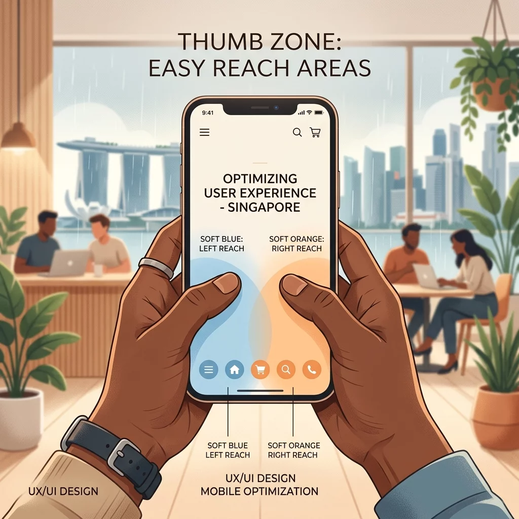
The term thumb zone refers to the area of a smartphone screen that is naturally comfortable for a user to reach with their thumb while holding the phone in one hand. When people hold their smartphones — typically with one hand, with their thumb doing most of the interaction — there is a specific region of the screen that requires minimal effort to tap. Anything outside this zone requires the user to either reposition their hand, use a second hand, or stretch uncomfortably.
Research from multiple user experience research firms has mapped out these zones in detail. The easiest-to-reach area, often called the "optimum thumb zone," spans the lower left and lower center portions of the screen for right-handed users, and the lower right and lower center for left-handed users. The most difficult areas are the very top of the screen and the extreme corners, which require either a fingertip stretch or a hand repositioning that interrupts the natural flow of interaction.
For Singapore business owners, this matters because every time a potential customer has to work to tap a button on your website, you are adding friction to their experience. And friction, in the world of web design, is the enemy of conversion. The easier you make it for someone to take the action you want them to take — whether that is calling your business, filling out a contact form, or purchasing a product — the more likely they are to do it.
Why Your Singapore Business Website Needs to Think About Thumb Zones
Singapore has one of the highest smartphone penetration rates in the world. Virtually every adult carries a phone, and a large percentage of them use their phones as their primary — and often only — way of accessing the internet. When someone searches for a plumbing service in Jurong or a dental clinic in Tampines on their phone, they are almost certainly doing so with one hand, perhaps while holding a bag or walking.
If your website forces these users to stretch their thumbs to reach important elements, you are creating a poor user experience that translates directly into lost business. Studies have consistently shown that mobile websites with poor usability see higher bounce rates, lower conversion rates, and worse overall customer satisfaction. For a small business, these metrics represent real money — lost enquiries, lost sales, and lost referrals.
Beyond conversions, there is also the credibility factor. In Singapore's competitive market, potential customers often compare several businesses before making a decision. A website that feels awkward to use on mobile signals to visitors that perhaps the business itself is not professional or detail-oriented. On the other hand, a website that feels effortless and intuitive creates an immediate positive impression that carries over into how they perceive your business as a whole.
The good news is that optimizing for thumb zones does not require you to rebuild your entire website. In many cases, a few targeted adjustments to button placements, navigation placement, and content layout can produce significant improvements. Let us walk through the specific steps you can take to make your website more mobile-friendly from a thumb zone perspective.
Step 1: Identify Your Most Important User Actions
Before you start moving buttons around on your website, you need to be clear about what you actually want your mobile visitors to do. Every business website has a primary goal — the single most important action you want a visitor to take. For some businesses, it might be making a phone call. For others, it might be submitting an enquiry form or initiating a WhatsApp chat. For e-commerce sites, it is almost certainly making a purchase.
Write down your primary conversion goal in plain language. It should look something like this: "I want mobile visitors to call our showroom" or "I want visitors to book an appointment through our contact form." This clarity will guide every subsequent decision you make about layout and element placement.
Once you have identified your primary goal, also list two or three secondary actions that support it. These might include navigating to your product catalog, saving your location to their phone, or chatting with you on WhatsApp for quick questions. Understanding this hierarchy will help you make smart decisions about which elements deserve prime thumb zone real estate and which can be placed in less prominent positions.
Step 2: Map Your Current Website Layout Against Thumb Zone Regions
Open your website on your own smartphone. Better yet, ask a few friends or family members to open it on their phones as well, since people have different hand sizes and holding preferences. For this exercise, you want to identify where your most important elements currently sit on the screen.
The key areas to evaluate are: the top navigation bar or menu icon, your primary call-to-action button, any phone number or contact links, your WhatsApp chat button if you have one, and your footer navigation. Each of these should ideally fall within the comfortable thumb reach zone for the majority of users.
A useful technique is to physically trace the path your thumb takes when performing the most common task on your site. If you want visitors to call you, for example, try doing it yourself on your phone. How many seconds does it take? Does your thumb have to stretch or adjust? If you find yourself needing to reposition your hand or using a second finger, that action is likely harder for your visitors too.
Take screenshots of your mobile website and mark them up with notes about which elements are in easy-to-reach zones and which are not. This visual reference will become valuable as you start making changes.
Step 3: Move Primary Call-to-Action Elements Into the Optimum Zone
The most critical adjustment you can make is to ensure that your primary call-to-action sits within the optimum thumb zone. This zone typically falls in the bottom third of the screen, centered between the left and right edges, with a slight bias toward the side where the user's thumb naturally rests depending on whether they are left or right-handed.
For most Singapore business websites, the primary call-to-action should be one of the following: a "Call Now" button, a "WhatsApp Us" button, a "Book Appointment" button, or a prominent "Get a Quote" form link. Regardless of which action you choose, the button or link needs to be large enough to tap easily — at least forty-four pixels by forty-four pixels, which is the minimum recommended size for touch targets according to Apple's Human Interface Guidelines and Google's Material Design standards.
Position this element so that it appears within natural thumb reach without requiring any scrolling on standard smartphone screens. If your primary call-to-action is below the fold — meaning users have to scroll to see it — consider moving it higher up on the page. You can also consider making it sticky, so it stays visible as the user scrolls, though this should be done carefully to avoid impeding the reading experience.
One common mistake many Singapore business websites make is placing their most important call-to-action at the very top of the page, in the header area. While this might seem logical from a visibility standpoint, it is actually the worst possible location from a thumb zone perspective. The top of the screen requires the user to stretch their thumb upward, which is the most uncomfortable position. Instead, consider placing your call-to-action near the middle or lower portion of the screen, especially as the first visible element below your hero section.
Step 4: Optimize Your Mobile Navigation Menu
Your navigation menu is another element that deserves careful thumb zone consideration. In Singapore, many website owners use a hamburger menu — the three-line icon that expands to show navigation links — placed in the top left or top right corner of the screen. While this is a common pattern, its placement often puts it in a difficult-to-reach zone for thumb navigation.
Consider whether your navigation menu truly needs to be at the top of the screen. For mobile-first business websites, some designers advocate for a bottom navigation bar, which places menu items directly in the thumb zone. This approach has gained significant traction in recent years, particularly for apps, but it can also work well for websites where users frequently need to navigate between different sections.
If you prefer to keep your hamburger menu at the top, at least ensure that the icon is large enough to tap easily. Also consider whether you can simplify your navigation to reduce the number of items inside the menu. Fewer items means less scrolling inside the menu, which means less thumb effort for your users.
Another option is to make your most important navigation items accessible through buttons placed within the thumb zone, rather than hiding them inside a menu. For example, if your primary service is air conditioning repair, you might place a "Our Services" button directly on the page in an easy-to-reach location, rather than forcing users to open a menu and search for it.
Step 5: Consider Single-Handed Use Patterns for Singapore Users
Singaporeans are often on the move. They might be checking your website while walking to the MRT station, holding onto a strap on the train, or carrying groceries. These scenarios all involve single-handed phone use, which makes thumb zone optimization even more critical.
When designing your mobile layout, think about the typical environment your visitors will be in. If many of your customers access your site while commuting, they are likely using one hand and need everything to be reachable without cross-body stretching. If they are at home or in the office, they might be more willing to use two hands or adjust their grip.
The safest approach is to assume single-handed use and design accordingly. Place your most critical interactive elements — your phone number, WhatsApp link, enquiry button — in the bottom center to bottom left region of the screen. This is where most people's thumbs naturally rest when they hold a phone, and it requires minimal adjustment to tap.
Also pay attention to how far down on the screen users need to scroll to reach your most important element. The further down it is, the more likely some users will abandon the action before completing it. Aim to have your primary call-to-action visible without scrolling on standard mobile screen sizes, which typically means it should appear in the top three hundred to four hundred pixels of the page.
Step 6: Test Your Changes With Real Users
Once you have made adjustments to your website layout based on thumb zone principles, the next critical step is testing. Do not rely solely on your own impressions — recruit friends, family members, or trusted colleagues to try your website on their phones and observe their behavior.
Ask them to perform specific tasks: find your phone number and call it, fill out an enquiry form, navigate to your services page. Watch where their thumbs move, whether they pause or hesitate at any point, and whether they seem to struggle with any particular element. Their feedback will reveal issues that you might have missed from your own perspective.
If you are working with a web designer or developer, share these observations with them and ask them to implement the changes. Most modern website builders and content management systems make it relatively straightforward to adjust button placements and layout without requiring a full redesign.
After making changes, run the same tests again to confirm that the improvements are effective. Document what you changed and why, so that if you ever need to update your website again, you have a clear record of the optimization decisions you made.
Step 7: Monitor Mobile Analytics to Track Your Progress
Once you have implemented thumb zone optimizations, you need a way to measure whether they are working. Google Analytics and other analytics tools can show you important metrics like your mobile bounce rate, average time on site, and conversion rate for mobile visitors compared to desktop visitors.
If your bounce rate decreases and your conversion rate increases after making these changes, that is a strong signal that your thumb zone optimization is paying off. If you do not see improvement, you may need to revisit your approach or investigate whether other factors — such as page load speed, content quality, or visual design — are also affecting user behavior.
Singapore business owners can use Google Analytics for free by installing a small tracking code on their website. If you have not already set this up, your web developer should be able to help you get it configured. Once you have analytics in place, make a habit of reviewing your mobile metrics at least once a month to track trends and identify new opportunities for improvement.
Additional Design Considerations for Singapore Business Websites
While thumb zone placement is critically important, it does not exist in isolation. Other design factors interact with thumb zone optimization to determine the overall mobile user experience on your website.
Page load speed is one of the most significant factors. Even if your buttons are perfectly positioned in the thumb zone, if your website takes more than three seconds to load, many mobile users will leave before they even see those buttons. Compress your images, minify your code, and consider using a content delivery network to ensure fast load times for Singapore audiences.
Font size and spacing also matter for mobile usability. Text that is too small forces users to pinch and zoom, which interrupts their flow and makes thumb zone navigation more difficult. Aim for a base font size of at least sixteen pixels for body text, and ensure adequate line height and paragraph spacing to make reading comfortable on small screens.
Touch-friendly form fields are another consideration. If you want users to fill out an enquiry form on their phone, every input field needs to be large enough to tap easily, and there should be adequate spacing between fields to prevent accidental taps on the wrong one. Also consider which fields are truly necessary — every extra field you add is another opportunity for a user to abandon the form.
Finally, ensure that your website handles all the common mobile interactions smoothly. Buttons should respond immediately when tapped with clear visual feedback. Links should be obviously tappable. Scrolling should feel natural and smooth, not jerky or laggy. These physical sensations contribute significantly to how users perceive your website and your business.
Common Mistakes Singapore Business Owners Make with Mobile Design
As you optimize your website for thumb zones, watch out for these common pitfalls that can undermine your efforts.
One mistake is overloading the screen with too many calls-to-action. When everything is important, nothing is important. If you have five different buttons competing for attention in the thumb zone, users will feel overwhelmed and may not click any of them. Choose one primary action and make it visually dominant, with secondary actions in smaller or less prominent positions.
Another mistake is ignoring left-handed users. Most thumb zone research focuses on right-handed users, but a significant portion of the population is left-handed. If possible, design for both by keeping primary actions in the center of the screen rather than biased to one side. Alternatively, consider offering a setting that lets users choose their dominant hand so the interface can adapt accordingly.
Some business owners also make the mistake of assuming that desktop and mobile users have the same priorities. On desktop, users might be comfortable navigating through multiple layers of menus to find what they need. On mobile, users are often in a hurry and want everything to be immediately accessible. Prioritize simplicity and speed in your mobile design.
Finally, avoid using hover states as the primary means of revealing information. Hover effects — where something changes when you mouse over it — do not work on touchscreens. Every important piece of information should be visible by default, not hidden behind a tap or a hover interaction.
Understanding how people naturally use their phones to interact with your website is one of the most impactful things you can do as a Singapore business owner. Thumb zone design is a practical, research-backed approach that directly addresses how real people hold and use their devices every day. By prioritizing the placement of your most important elements within easy thumb reach, you remove friction from the user experience, increase the likelihood that visitors will take the actions you want them to take, and ultimately drive better business results from your website.
Start by reviewing your current website layout, identifying where your primary call-to-action sits, and testing whether it falls within comfortable thumb reach. Make the adjustments outlined in this guide, track your results using analytics, and continue refining over time. Even small improvements in thumb zone optimization can translate into meaningful gains in conversions and customer satisfaction.
If you still need help, feel free to contact us at https://webcare.sg/contact for a free website health check.