When was the last time you filled out a newsletter signup form on a website? Did it feel like a chore, or did it feel like the start of something valuable? For most Singapore business owners, their newsletter signup forms are buried deep on their websites, visually unappealing, and ask for more information than necessary. The result? Potential customers click away before they even consider joining your mailing list. This is a problem because email marketing remains one of the highest-return marketing channels available to small businesses in Singapore. If your signup form is not working, you are losing customers every single day without even knowing it.
Designing a newsletter signup form that people actually want to use is not about adding more fields or making it flashier. It is about understanding what your visitor wants in exchange for their email address and making the process as effortless as possible. In this guide, you will learn exactly how to design and optimise your newsletter signup form so more people actually subscribe, stay subscribed, and eventually become paying customers.
Step 1: Decide What You Are actually offering
Before you touch any design tool or write a single line of copy, you need to be crystal clear about what you are giving away. People do not subscribe to newsletters for the privilege of hearing from you. They subscribe because they get something valuable in return. That value could be educational content, exclusive discounts, early access to new products, or actionable tips they cannot find elsewhere.
Take some time to write down three specific benefits that your newsletter delivers. For example, instead of saying "Subscribe for updates," say "Get weekly tips on saving money on your business electricity bills" or "Be the first to know about our flash sales with discounts up to 40% off." The more specific and tangible your offer, the higher your conversion rate will be. Write your benefits down and keep them visible as you build your form.
Step 2: Keep Your Form Fields to an Absolute Minimum
The single biggest mistake Singapore business owners make with their newsletter signup forms is asking for too much information. Every additional field you add to your form reduces your conversion rate by approximately 10 to 15 percent. If your form asks for a name, email, phone number, company name, and job title, most people will abandon it entirely.
For most small businesses, an email address is all you need. That is it. Just the email address. If you later need the subscriber's name for personalisation purposes, you can ask for it in your welcome email or welcome series after they have already subscribed. The rule is simple: only ask for what you absolutely need right now to complete the subscription. Everything else can wait until you have built trust with your new subscriber.
Step 3: Write a Compelling Headline and Description
Your form needs a headline that clearly states what the visitor is signing up for, not just "Subscribe to our newsletter." Your headline should communicate the specific benefit you identified in Step 1. Place it directly above or inside your form so visitors do not have to search for it.
Keep your description short and benefit-driven as well. One or two sentences is sufficient. Focus on what the visitor gains, not on what you want from them. Instead of "We send emails every week," try "Join 2,000+ Singapore small business owners who get our weekly tips on growing their business online." Social proof embedded in your description immediately builds credibility and trust.
Step 4: Choose the Right Placement for Your Signup Form
Where your form appears on your website matters enormously. Placing it at the bottom of your "About" page after months of reading is too late. The visitor has already made the decision to leave before they even see your form. Instead, place your signup form where people are already engaged and interested.
The most effective placements for newsletter signup forms on Singapore business websites include: right after your hero section at the top of your homepage, as a pop-up that triggers after a visitor has been on your page for 30 to 60 seconds, within your blog posts either at the beginning or end of the article, and in a dedicated section on your contact page. Experiment with multiple placements and track which ones convert the most subscribers over a four-week period before making a final decision.
Step 5: Design Your Form for Visual Clarity and Trust
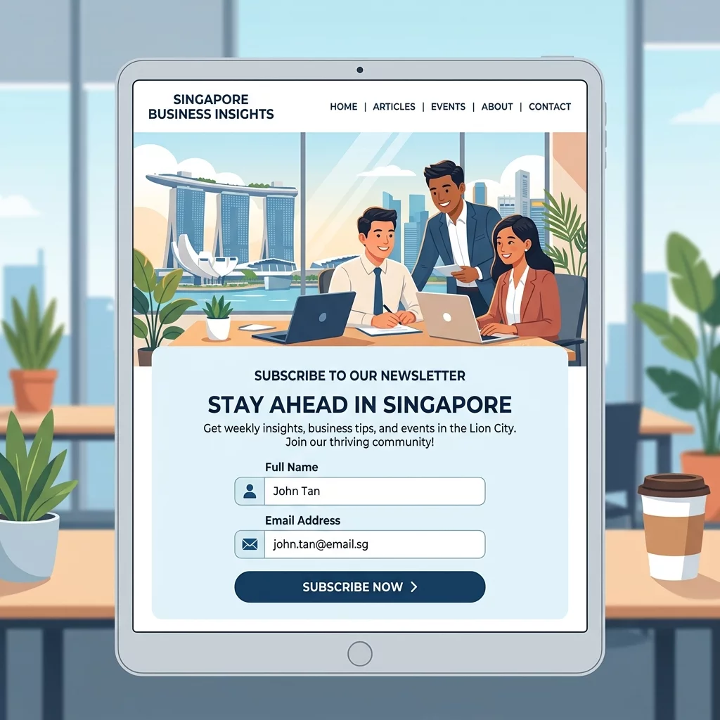
Your form design should be clean, uncluttered, and immediately readable. Use a contrasting background colour for your form container so it stands out from the rest of your page. Your email input field should be wide enough to show the full placeholder text, and your submit button should be visually distinct with a colour that draws the eye.
Add a privacy reassurance line directly below your submit button. This is critical in Singapore where the Personal Data Protection Act governs how businesses handle customer information. A simple "We respect your privacy. Unsubscribe anytime." below your button significantly reduces subscriber anxiety and increases conversions. You can also link this to your privacy policy page for full transparency.
Step 6: Optimise Your Call-to-Action Button Text
The text on your submit button matters more than most people realise. Generic buttons that say "Submit" or "Subscribe" perform worse than specific, benefit-driven button text. Think about the action the visitor is taking and what they gain from it.
Strong performing button texts for Singapore businesses include "Get My Free Guide," "Send Me the Weekly Tips," "Join the Community," and "Get Early Access." Test at least three different button texts over a two-week period and compare the conversion rates. Small changes to button text can yield 20 to 30 percent improvements in subscription rates without any other changes to your form.
Step 7: Test Your Form on Mobile Devices
More than 60 percent of web browsing in Singapore happens on mobile devices. If your signup form is difficult to use on a phone, you are losing the majority of your potential subscribers. Test your form by opening your website on your own smartphone and going through the subscription process.
Make sure your email input field is large enough to tap with a thumb, your submit button has enough padding to be easily clickable, and the entire form fits within the visible screen area without requiring horizontal scrolling. If your form triggers a pop-up on desktop, ensure it is not intrusive or annoying on mobile where screen space is already limited.
Step 8: Add a Welcome Email That Delivers on Your Promise
Getting someone to subscribe is only half the battle. If your welcome email does not deliver the value you promised in your form, you will see a high unsubscribe rate within the first week. The moment someone confirms their subscription, they should immediately receive a welcome email that delivers exactly what you promised.
If your form offered a free downloadable guide, send it within five minutes of subscription. If your form promised weekly tips, your first email should be a perfect example of the quality content they can expect every week. This immediate delivery builds trust, confirms that subscribing was the right decision, and sets the tone for your entire email relationship going forward.
Step 9: Monitor Your Form Performance and Iterate
Set up tracking on your signup form so you can measure its performance over time. At a minimum, track how many people see your form versus how many actually subscribe. This gives you your conversion rate. If fewer than 2 percent of visitors to your form are subscribing, there is significant room for improvement.
Review your form performance every two weeks and make one change at a time. If you change the button text, wait two weeks before changing something else so you can accurately measure the impact of each modification. Common improvements to test include changing your headline, adjusting the form placement, reducing the number of fields, tweaking the button colour, and editing your description text.
Step 10: Consider Using a Pop-Up Form Strategically
Exit-intent pop-ups that appear when a visitor is about to leave your website can be highly effective when used correctly. However, they must not be intrusive or annoying. A well-designed exit pop-up appears only once per visitor session, covers only a small portion of the screen, and includes a clear close button.
For Singapore businesses, exit pop-ups work particularly well on blog posts where a visitor has read at least 50 percent of the content. This indicates genuine interest, and the pop-up serves as a last-chance offer to capture the lead before they leave. Offer your most valuable content upgrade or exclusive discount as the incentive to make the pop-up feel like a genuine opportunity rather than an interruption.
If you still need help, feel free to contact us at https://webcare.sg/contact for a free website health check.