How to Diagnose and Fix Your Website Navigation: A Practical Guide for Singapore Business Owners
You have invested in a beautiful website for your Singapore business, but something is wrong. Visitors arrive but leave within seconds. They do not call, do not fill out your contact form, and never come back. The issue might not be your products, your prices, or your branding. It might be that people simply cannot find their way around your website.
Navigation is the roadmap that guides visitors through your site. When it works well, people find what they need and take action. When it fails, they leave in frustration. This guide will walk you through exactly how to diagnose your navigation problems and fix them step by step, even if you have zero technical experience.
Understanding Why Navigation Problems Cost You Customers
Every day, potential customers visit your website looking for answers. They want to know what you sell, how much it costs, and how to reach you. If your navigation does not make these answers immediately accessible, they will look elsewhere.
Consider this scenario. A user lands on your homepage from Google. They want to see your pricing but cannot find a "Prices" or "Packages" link in your menu. They see words like "Solutions" and "Insights" and "Our Approach" but none of these tell them anything useful. Within fifteen seconds, they are back on Google clicking on your competitor instead.
This happens far more often than business owners realise. Most website owners are so familiar with their own site structure that they no longer see the confusion through a new visitor's eyes. That is why auditing your navigation from scratch is the essential first step.
Step 1: Map Out Your Current Navigation Structure
Before you can improve anything, you need to see exactly what exists today. Walk through your website as if you are a first-time visitor with no context. Open your homepage in a new browser window, ideally an incognito or private window so your browser does not remember any previous visits.
Spend two minutes clicking through your menu. Write down every page that appears in your main navigation. For each page, note whether you expected to find it there and whether clicking it took you where you thought it would go. Pay special attention to dropdown menus. Are there items inside dropdowns that should be in the main menu? Are there items in the main menu that should be hidden in dropdowns instead?
Also check your footer. Many websites put secondary navigation links in the footer, such as privacy policies, terms of service, or sitemap links. While this is useful, your primary menu should contain the most important pages. If your footer has links that your main menu is missing, consider whether those pages are important enough to also appear in your primary navigation.
Step 2: Identify Pages That Should Be in Your Menu
Not every page on your website needs to be in the main menu. In fact, cluttering your menu with too many options is one of the most common navigation mistakes. The goal is to show visitors only what they need most, when they need it.
Ask yourself which pages your potential customers search for most often. For a typical Singapore small business, these are usually the homepage, services or products, pricing, about the business, and contact information. These five to seven pages form the core of your navigation.
Other pages like team bios, detailed case studies, company history, or individual blog posts should not clutter your main menu. Instead, they should be accessible through relevant main pages or through your footer. For example, if you have a "Services" page, it should link to your individual service pages. If you have a blog, readers can reach it through a blog link in your header or footer.
Step 3: Rename Menu Items Using Customer Language
One of the easiest fixes that often gets overlooked is simply renaming your menu items. Many business owners use internal terminology or clever marketing language that visitors do not understand. The fix is to use the same words your customers use when they are looking for what you offer.
Go through each menu item and ask yourself this question. If someone searched Google for what this page contains, what would they type? If the answer is different from your menu label, change the label to match the search term.
For instance, "Our Methodology" could become "How It Works." "Insights" could become "Blog" or "Articles." "Company" could become "About Us." These simple word changes reduce confusion because they immediately tell visitors what to expect when they click.
Also check that your labels are consistent. If one menu item says "Pricing" but another says "Our Packages," visitors may think these are different things when they are not. Use the same terminology throughout your menu to set accurate expectations.
Step 4: Restructure Your Dropdown Menus
Dropdown menus help organise many related pages without cluttering your main menu. However, they need to be set up correctly to work well. A poorly designed dropdown is almost worse than no dropdown at all because it wastes the visitor's time.
Limit each dropdown to no more than seven items. More than seven options overwhelms visitors and makes choice difficult. If you have more than seven related pages, split them into subcategories with their own headers.
Make sure the label at the top of each dropdown (the parent item) is itself a clickable link. Visitors should be able to click on "Services" to reach a main services page, and then use the dropdown to choose specific service types. Without this, users who click the parent expecting a page will get nothing.
Keep dropdown depth to a maximum of two levels. A menu structure like Home > Services > Web Design > Basic Package is too deep. Visitors get lost trying to figure out where they are and how to go back up a level. Two-level navigation like Home > Services > Web Design is much easier to follow.
Step 5: Test Your Navigation on Mobile Devices
In Singapore, the majority of web browsing happens on mobile phones. This means your navigation must work perfectly on small screens, not just on desktop computers. The challenge is that what works on a desktop often fails on mobile, and vice versa.
Open your website on your phone right now. Does your menu appear as a hamburger icon (three horizontal lines)? When you tap it, does the full menu appear clearly? Are the tap targets large enough that you can accurately tap each item with your finger? Many mobile menus have buttons that are too small or too close together, making them frustrating to use.
Check whether dropdown menus work on touch screens. Some websites have dropdowns that require hovering with a mouse cursor. On a phone, there is no cursor, only a finger tap. If your dropdowns require hover actions to work, they will not function properly on mobile. You need tap-based dropdowns that expand when tapped and collapse when tapped again or when another item is selected.
Also verify that your phone menu does not cover the entire screen in a way that makes it impossible to see what you are clicking. Some mobile menus take over the whole screen with no option to scroll or see other items without closing and reopening the menu multiple times.
Step 6: Add Breadcrumb Trails to Inner Pages
Breadcrumbs are the small text paths that appear near the top of a page, showing visitors where they are within your site hierarchy. For example, a breadcrumb might display: Home > Services > Web Design. They serve as a secondary navigation aid that helps visitors understand where they are and easily jump back to higher-level pages.
Breadcrumbs are especially valuable on websites with many sections and subsections. When someone lands on a deeply nested page, breadcrumbs immediately show them the path back to more general content. Without breadcrumbs, the only way back is often the browser back button, which feels disorienting.
Most modern website platforms include breadcrumb functionality either built-in or available through plugins. For WordPress sites, popular plugins like Yoast SEO include breadcrumb controls. For other platforms, check your theme settings or search for breadcrumb plugins specific to your platform.
When setting up breadcrumbs, make each level a clickable link except for the current page. The current page should display as plain text, not a link, so visitors know exactly where they are without accidentally clicking back to the same page.
Step 7: Add a Visible Site Search Function
No matter how well you organise your navigation, some visitors will always prefer to search. When someone cannot find what they need by clicking through menus, a search box gives them an alternative path. Without search, visitors who cannot navigate to what they want will simply leave.
Place your search box where visitors expect to find it. The top right corner is the standard location. Make sure it is large enough to be visible but not so prominent that it distracts from your main menu. The search box should have a clear placeholder like "Search..." so visitors know what it is for.
Consider a search feature that shows results as the user types, rather than requiring them to press enter first. This type-ahead or autocomplete search is faster and more intuitive, and it helps visitors find what they need even when they are not exactly sure what words to use.
If your WordPress site, the default search is often poor at finding relevant results. Plugins like SearchWP or Relevanssi dramatically improve search accuracy by indexing your actual content rather than just page titles. For other platforms, explore what search enhancements are available in your app store or plugin directory.
Step 8: Find and Fix Broken Navigation Links
Nothing damages trust faster than clicking on a menu item and landing on a broken page or error message. Before you make any other navigation changes, check every single link in your menu to verify it works correctly.
Common problems that create broken links include pages that were deleted without updating the menu, URL changes that were not reflected in navigation settings, and typos in menu link addresses. All of these are easy to fix once you find them.
Also watch for redirect issues. A redirect happens when clicking a link automatically sends you to a different page. Sometimes these chains get broken or loop infinitely, creating situations where the browser never finishes loading. These redirect loops are usually caused by misconfigured redirect rules in your website settings or hosting control panel. If you find redirect loops, check your redirect settings or ask your hosting provider for help.
For more detailed troubleshooting of access-related errors, our guide on troubleshooting 500 internal server errors covers related issues that sometimes affect navigation links.
Step 9: Add Visual Indicators for Current and Hover States
Your navigation should always provide feedback that tells visitors what is clickable and where they are currently located. Without these visual cues, visitors feel uncertain and lost.
When someone hovers their cursor over a menu item, there should be a visible change such as a colour shift, an underline, or a background highlight. This tells the visitor the item is interactive and they can click it. Without hover states, visitors may not realise certain text or images are clickable.
Similarly, the page you are currently viewing should be highlighted in your navigation. If someone is reading your "Pricing" page, the "Pricing" menu item should look clearly different from all the other items. This immediately tells visitors where they are in your site and confirms that the page they wanted to visit loaded correctly.
These visual cues do not require advanced coding. Most website builders and WordPress themes include hover and active states in their default styling. Check your theme settings or navigation options to make sure these features are enabled and visible.
Step 10: Run User Testing to Validate Your Changes
After you have made all your navigation improvements, test them with real people. This is the step that most business owners skip, but it is the only way to truly know if your changes work.
Recruit five to ten people who are not familiar with your website. Give each person simple tasks to complete, such as finding your phone number, reading about your main service, or locating your contact form. Do not help them or guide them during the test. Simply watch where they struggle and note which steps cause confusion.
Pay close attention to how long each person takes to complete each task. If someone takes more than thirty seconds to find something, that is a navigation problem that needs further fixing. Also note where people click that does not lead where they expect, as this reveals labels or structure issues you may have missed.
If you cannot gather test participants, use tools like Google Analytics to see where visitors spend the most time and where they exit most frequently. High exit rates on specific pages often indicate navigation problems on those pages or leading up to them.
Navigation Improvement Checklist
Before you consider your navigation work complete, run through this checklist to make sure nothing was missed:
- Mapped out current navigation structure
- Identified essential pages for main menu
- Renamed menu items to match customer language
- Restructured dropdowns with seven or fewer items per level
- Tested mobile menu on actual phone devices
- Added breadcrumb trails to inner pages
- Included visible search function in header area
- Verified every menu link works without errors or redirect loops
- Enabled hover states and current page indicators
- Completed user testing with at least five participants
Getting Professional Help With Your Website Navigation
While many navigation fixes are straightforward enough for business owners to handle themselves, some situations benefit from professional assistance. If your website has dozens of pages, complex category structures, or code-level issues that you cannot resolve, an experienced web developer can identify problems and implement solutions more quickly than trial and error.
If after working through this guide you are still seeing poor visitor engagement, high bounce rates, or low conversion rates, there may be deeper issues beyond navigation that require a comprehensive website audit. The team at WebCareSG specialises in diagnosing and fixing exactly these kinds of problems for Singapore businesses. Visit our contact page to discuss your website challenges and let us help you turn visitors into customers.
Related WebCare Solutions
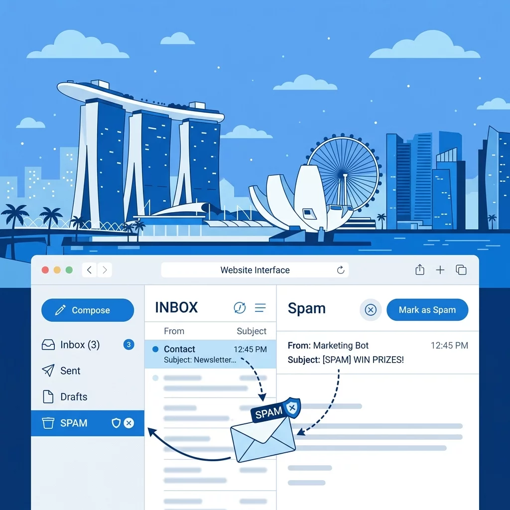
Fix Common Tracking Issues: Duplicate Events, Missing Pages, Bot Traffic
A comprehensive guide to troubleshooting and fixing common website tracking issues like duplicate events, missing pageviews, and bot traffic to ensure your data is accurate.
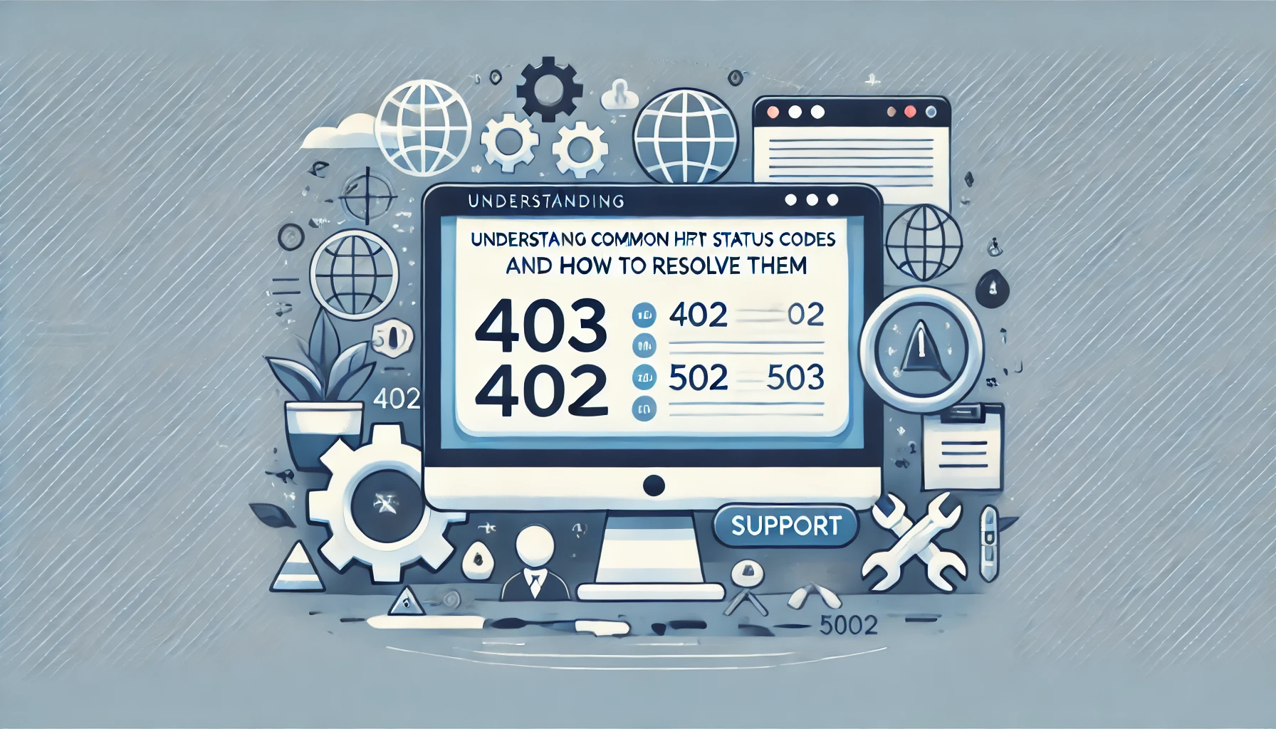
Understanding Common HTTP Status Codes and How to Resolve Them
Learn about common HTTP status codes like 403, 404, 502, 503, and 401. Understand their causes and solutions with practical examples and code.
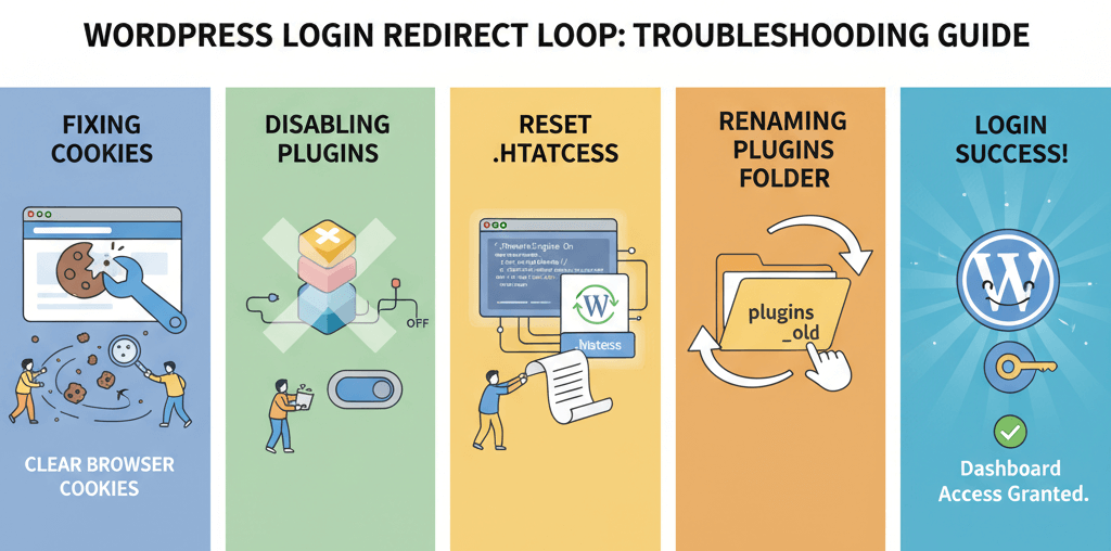
Unable to Login to wp-admin: Fix Login Page Redirect Loops
A practical guide to diagnosing and fixing WordPress login page redirect loops by clearing cookies, disabling plugins, resetting .htaccess, and inspecting for common culprits.
Ready to get started?
Focus on your business while we fix your website. Contact WebCareSG today for fast, reliable solutions!
Whatsapp us on