How to Fix a Confusing Website Menu: A Step-by-Step Guide for Singapore Business Owners
If a potential customer lands on your website and cannot figure out where to find your products, services, or contact information within five seconds, the odds are they will leave and never return. This phenomenon is called navigation confusion, and it costs Singapore businesses thousands of dollars in lost leads and sales every year. The worst part? Most business owners do not even know it is happening because no one is telling them their menu is broken.
The good news is that fixing your website navigation is one of the most impactful changes you can make without redesigning your entire site. In this guide, we will walk you through exactly how to identify a broken navigation menu, understand what is causing the problem, and apply practical fixes that any non-technical business owner can do. Whether your site is on WordPress, Shopify, or a custom-built platform, these principles apply to you.
Why Website Navigation Matters More Than You Think
Before we get into the fix, let us address the obvious question: why should you care about something as basic as a menu? The answer lies in how people actually browse the web.
Studies consistently show that website visitors form an opinion about your business within 0.05 seconds of loading your page. If your navigation is confusing, cluttered, or hard to find, that instant judgement turns negative. A clear navigation menu does three critical things for your business:
- Builds trust: A professional, well-organised menu signals that your business is legit and has its act together.
- Reduces bounce rate: When visitors can easily find what they are looking for, they stay longer and explore more pages.
- Drives conversions: Every extra click a visitor has to make to reach your contact form or product page is an opportunity to lose them. Simplified navigation removes those friction points.
Think of your website menu like the signage in a shopping mall. Good signage tells shoppers exactly where to go without asking anyone for help. Bad signage causes frustration and abandoned shopping carts. Your website menu works exactly the same way.
Step 1: Audit Your Current Navigation Menu
Before you can fix anything, you need to understand what is broken. Start by performing a navigation audit on your own website. Do this honestly, and if possible, ask someone who has never seen your site to try finding specific pages.
Things to check in your audit:
- Log in to your website on your phone. Can you find the menu easily? Is it responsive?
- Count how many items appear in your main menu. If it has more than seven items, it is likely too crowded.
- Check if your most important pages — your services, about page, and contact form — are visible in the top-level menu without clicking anything.
- Look at your menu labels. Are they vague terms like "Solutions" or "Explore," or clear terms like "Our Services" and "Get a Quote"?
- Test what happens when you click your logo. Does it take you to the homepage? This is a standard expectation that many sites still get wrong.
Write down every problem you find. This becomes your fix list. If you discover you have broken links in your menu, our guide on how to identify and fix broken internal links will help you address those systematically.
Step 2: Define Your Most Important Pages
Not every page on your website deserves top-level real estate in your navigation menu. Your main menu should only include the pages that the majority of your visitors absolutely need to see. For most Singapore small businesses, this list is surprisingly short:
- Home: Always linked via your logo.
- Products or Services: Whatever you sell, this is likely why people visited in the first place.
- About Us: Builds credibility and trust, especially for new visitors.
- Contact: The ultimate conversion action for most business websites.
- Blog or Resources: Optional, but valuable if you publish content regularly.
That is it. Five items maximum for your primary navigation. Everything else should either be moved to a footer menu, grouped under dropdown submenus, or removed entirely. A bloated menu overwhelms visitors and dilutes the focus of your most important pages.
Step 3: Redesign Your Menu Structure
Once you have identified your priority pages, it is time to restructure your menu. Here is how to do it properly, whether you are using WordPress, Wix, Squarespace, or any other platform.
Use clear, descriptive labels
One of the most common navigation mistakes is using jargon or clever marketing language in menu labels. "Our Value Proposition" sounds impressive but tells a visitor nothing. "How We Help" is slightly better. "Marketing Services for Singapore Businesses" is clear and specific.
Go through every menu item and ask yourself: if someone who has never heard of my business reads this label, will they know exactly what they will find on that page? If not, rewrite it.
Organise items in logical groupings
Group related pages together under logical dropdown categories. For example, if you offer accounting, tax filing, and payroll services, do not list all three as separate top-level menu items. Instead, create a dropdown menu called "Services" with three sub-items underneath. This keeps your top navigation clean while giving visitors who want details an easy path to find them.
Place the most important items on the left side of your menu. In Western and Singaporean reading cultures, left-to-right scanning means users naturally start on the left. Your highest-priority page should be the first or second item from the left.
Limit dropdown depth to one level
Dropdowns that expand into additional dropdowns — known as multi-level or mega-menu structures — are one of the most confusing navigation patterns on the web. If a visitor has to hover through three levels of menus to find what they need, they will give up. Stick to one dropdown level maximum. If you need more space than that, consider a different navigation approach such as a sidebar menu or a well-organised footer.
Step 4: Make Your Navigation Mobile-Friendly
More than 60 percent of web traffic in Singapore now comes from mobile devices. This means your navigation menu absolutely must work well on smartphones and tablets. If your mobile menu is an afterthought, you are losing the majority of your potential customers.
The most important mobile navigation principle is the hamburger menu. That familiar three-line icon in the top corner of a mobile screen is the standard way to hide the full navigation menu on smaller screens. When a visitor taps it, the menu slides in from the side or drops down from the top. This pattern is so universally understood that deviating from it confuses users.
When setting up your mobile navigation, make sure the tap targets for each menu item are large enough. Each link should be at least 44 pixels tall — this is the accessibility standard recommended by Web Content Accessibility Guidelines. Small tap targets are frustrating on touchscreens and can accidentally trigger the wrong link.
Our guide on how to fix poor mobile responsiveness and keep users engaged covers these mobile navigation principles in greater detail, including how to test your site on different device sizes without buying multiple phones.
Step 5: Add a Search Bar to Your Navigation
If your website has more than 20 pages, you need a search bar embedded in your navigation area. Not all visitors want to browse through menus — some know exactly what they are looking for and will search for it directly. If your site search is broken, hard to find, or missing entirely, these visitors will leave and search on Google instead, potentially landing on a competitor.
Place your search bar in a prominent position within your header navigation. It should be visible without clicking anything. The search bar should also be functional on mobile — a surprising number of WordPress and Shopify themes include a search icon that does nothing when tapped on phones.
Step 6: Test Your Navigation With Real Users
Once you have made your changes, you need to verify they actually work. The best way to do this is a simple user test that costs nothing and takes about 20 minutes.
Ask five people — colleagues, friends, or family members who represent your target customer — to perform three specific tasks on your website. For example:
- Find your contact form and tell you what email address it sends to.
- Find the page describing your main service or product.
- Find your pricing page if you have one.
Do not help them during the test. Just watch and note where they hesitate, click the wrong item, or give up. If more than two out of five people struggle with any of these tasks, your navigation still needs work.
If you do not have five people available to test, an alternative is to use Google Analytics. Go to your Behaviour Flow report and look at where visitors are dropping off. If a large percentage of visitors are leaving after the homepage, your navigation from the homepage to other key pages may be unclear.
Step 7: Verify Accessibility in Your Navigation
Web accessibility is not just about compliance — it is about making sure every visitor can use your site, including those using screen readers or keyboard navigation. A navigation menu that is confusing for sighted users is often completely unusable for visitors with disabilities.
Some basic accessibility checks for your menu include making sure all menu items are reachable by pressing the Tab key on your keyboard, ensuring screen reader software can read your menu labels correctly, checking that your current page is visually indicated in the menu, and confirming that your mobile hamburger menu can be opened and closed using only the keyboard.
The 2026 guide to web accessibility WCAG 3.0 covers these standards in depth and provides checklists you can follow to ensure your navigation meets modern accessibility requirements.
Quick Navigation Fixes You Can Do Today
If you do not have time for a full navigation overhaul right now, here are three quick wins you can apply immediately:
- Update your menu labels: Spend 10 minutes going through each label and making it clearer and more specific to your business. This costs nothing and takes only your time.
- Move low-priority pages to the footer: If you have utility pages like "Privacy Policy," "Terms of Service," or "Sitemap" in your main menu, move them to the footer immediately. They do not belong in primary navigation.
- Add a sticky header: A sticky header keeps your navigation menu visible at the top of the screen as visitors scroll down. Most website platforms include this as a built-in option. Enable it and your navigation will always be one click away.
When to Call in Professional Help
DIY fixes work well for straightforward navigation problems. However, if your website has a complex structure with dozens of pages, multiple product categories, or a custom-built navigation system, you may find yourself spending hours trying to fix something that a professional can resolve in minutes. There is no shame in that — a skilled web developer understands information architecture patterns that a business owner simply has not had reason to learn.
More importantly, if your navigation issues are tied to underlying problems in your website code, theme, or platform configuration, you may be treating symptoms rather than the disease. A qualified website repair service can diagnose whether your navigation problem is actually a deeper structural issue hiding underneath.
If your navigation problems are related to SSL certificate warnings or other technical issues that make your site appear unsafe, fixing those technical problems first will give your navigation improvements the best chance of working. Our guide to resolving SSL certificate issues on your Singapore website walks you through that process step by step.
Whether you tackle these fixes yourself or bring in a professional, the important thing is to start. A confusing menu is not a small problem — it is an invisible wall between your business and your customers. Remove that wall, and you will be surprised how quickly your website conversions improve.
If you have tried the steps in this guide and your navigation is still not performing the way you need it to, or if you simply do not have the time to handle the technical details, WebCareSG offers website repair services specifically for Singapore business owners. Visit https://webcare.sg/contact to get in touch and let our team help you fix your website navigation properly.
Related WebCare Solutions

Turbocharge Your Website: 7 Simple Steps to Speed Up Your Site Today!
A slow website costs you customers. Every 1-second delay reduces conversions by 7%. Here is how to make your Singapore business website faster without spending a cent on developers.
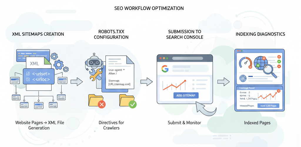
XML Sitemaps and robots.txt: Your Guide to Crawlability and Indexing
A comprehensive guide on how to create, submit, and troubleshoot XML sitemaps and robots.txt files to ensure search engines can effectively crawl and index your website.
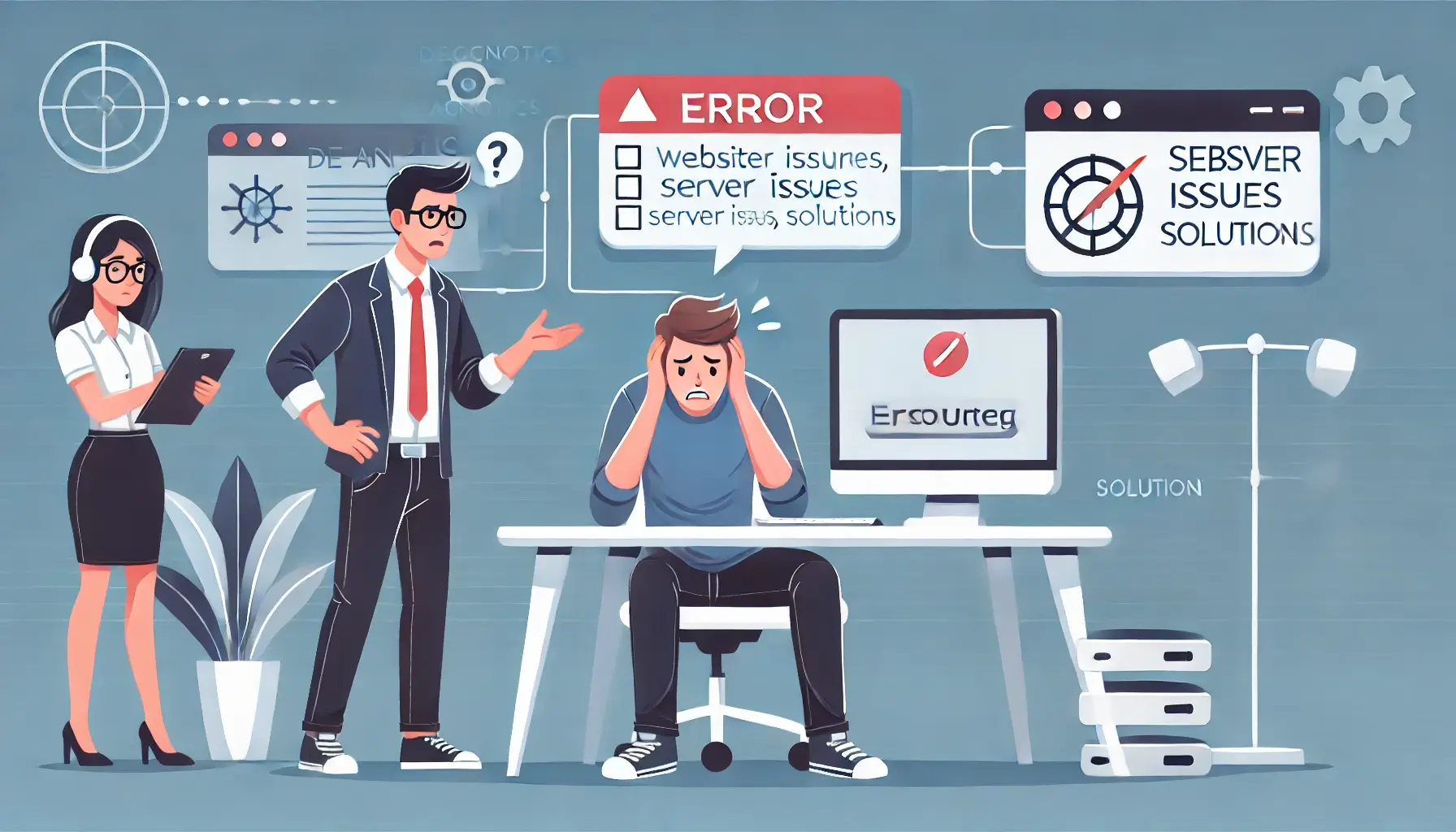
Website Still Not Working? Here’s What to Do Next
Facing persistent website issues? This guide provides a comprehensive checklist to troubleshoot common problems before seeking professional assistance.
Ready to get started?
Focus on your business while we fix your website. Contact WebCareSG today for fast, reliable solutions!
Whatsapp us on