How to Fix Confusing Website Navigation Before Your Singapore Customers Leave
You have spent money on a beautiful website. Traffic is coming in. But within 30 seconds, visitors are leaving. The culprit is almost always the same: confusing navigation. When a person lands on your site and cannot find the Contact page, the Services section, or the pricing information within a few clicks, they do not stick around to figure it out. They leave and call your competitor instead. This is not a design problem you can ignore. It is a revenue problem costing you customers every single day.
For Singapore business owners, this is especially painful. You are competing against hundreds of similar businesses, many using the same website templates and having the same navigation problems. Fixing yours gives you an immediate advantage. In this guide, you will learn exactly how to identify bad navigation, understand why it hurts your business, and fix it step by step without hiring a developer.
Why Navigation Matters More Than You Think
Navigation is the map of your website. It tells visitors where to go, what you offer, and how to trust you. When it is clear and logical, people stay longer, read more, and are far more likely to contact you or buy something. When it is messy or confusing, even interested customers give up and leave.
Research consistently shows that most website visitors make a decision to stay or leave within the first 10 seconds. Your navigation is the first thing they interact with. If they cannot see immediately how to find what they need, they assume your business is hard to deal with and move on. This is called a bounce rate, and high bounce rates hurt your Google rankings too, since Google sees people leaving quickly as a sign that your site is not helpful.
The good news is that navigation problems are among the easiest website issues to fix. You do not need to rebuild your site. You need to look at it from your customers point of view and make a few strategic changes.
Step 1: Put Yourself in Your Customers Shoes
Before you change anything, you need to understand how real people experience your website. Start by writing down the three to five things your most important visitors want to find when they come to your site. For a cleaning company, that might be pricing, service areas, booking form, and contact details. For a law firm, it might be areas of practice, team bios, testimonials, and a consultation request.
Write your list down. Then open your website in a private or incognito browser window. You want to see the site exactly as a new visitor would, without any saved passwords or remembered menus affecting what you see. Try to find each item on your list using only the navigation menu. Do not use the search bar. Do not click on random footer links. Use only the main menu. Note how long it takes to find each item and whether it makes logical sense.
If you found any item hard to locate, that is a navigation problem you need to fix. Write down what you tried and where you got stuck. This becomes your fix checklist.
Step 2: Audit Your Current Navigation Menu
Open your website and look at your current menu. Walk through these questions and make notes:
- How many items are in your main menu? If there are more than seven, you probably have too many choices, which makes decision-making harder for visitors.
- Are the menu labels clear? "Solutions" or "Offerings" are vague. "Accounting Services" or "Our Pricing" is specific and tells people exactly what they will find.
- Is the most important item first or second? The first menu item gets the most attention. Put your most sought-after page there.
- Can you reach your contact page from the main menu in one click from anywhere on the site?
- Do you have dropdown menus with too many nested items? Deep menus where you have to click, hover, and click again frustrate people.
- Is your menu the same on mobile? Many Singapore business owners fix desktop navigation but forget that mobile navigation is even more important since most local web traffic now comes from phones.
Take screenshots of your current menu on both desktop and mobile. You need a before picture to compare with the after result.
Step 3: Simplify Your Menu Structure
Less is more when it comes to navigation menus. The goal is to reduce the number of top-level choices while still making everything accessible. Here is how to do it:
- Group related pages under one heading. If you have separate pages for "Corporate Cleaning", "Office Cleaning", and "Home Cleaning", consider grouping them under "Our Services" and letting visitors click through to see the sub-pages.
- Remove unnecessary items. If you have a menu item that fewer than 5 percent of visitors click, it is taking up space without providing value. Consider removing it or moving it to the footer.
- Use plain language. Replace industry jargon with words your customers actually use. Instead of "Value-Added Solutions", write "How We Help You".
- Put the most important actions front and center. If you want people to book a consultation, "Book Now" should be a prominent button, not buried in a dropdown.
- Ensure every menu item goes somewhere real. A menu item that leads to a 404 error page is worse than having no link at all. Learn how to fix 404 errors and broken links here.
Step 4: Add Visual Cues to Guide Attention
Words alone are not enough. Your navigation needs visual cues to help people understand where they are and where they can go next. Some of the most effective techniques include:
- Highlight the current page. When someone is on a page, the menu item for that section should visually stand out, either with a different colour, bold text, or an underline. This prevents people from getting lost.
- Use buttons for key actions. A bright "Get a Quote" or "Contact Us" button stands out far more than a text menu item. Use it for your most wanted action.
- Add icons next to key items. A phone icon next to your contact number, a shopping cart icon for your store, makes pages instantly recognizable even before people read the words.
- Include breadcrumbs on inner pages. Breadcrumbs are the small text trail that appears near the top of a page, showing "Home > Services > Corporate Cleaning". They help people understand where they are and easily go back a level.
Step 5: Test Your Navigation on Mobile
More than 60 percent of web traffic in Singapore comes from mobile devices. If your navigation does not work perfectly on a phone screen, you are losing the majority of your potential customers. Here is what to check:
- Open your website on your own phone. Navigate through the main menu using only your thumb. Is it easy, or do you need to zoom in and out?
- Check if your dropdown menus work with a finger tap. Some menus require hovering with a mouse, which does not work on touch screens. Make sure every menu item is tap-friendly.
- Verify that your phone number is tap-to-call. When someone clicks your phone number from their mobile, it should open the dialer automatically. If it does not, you are missing leads.
- Look at your menu button. On mobile, the menu is usually hidden behind a "hamburger" icon, which is three horizontal lines. Make sure the icon is clearly visible and labelled. Some visitors will not know what the hamburger icon means, so adding a text label like "Menu" next to it helps.
If your mobile navigation is difficult to use, this is a high-priority fix. You can read more about mobile responsiveness fixes here.
Step 6: Add a Search Function if You Have Multiple Pages
If your website has more than 20 pages, your visitors need a search bar. Some business owners worry that search means people are lost. Actually, people who use search tend to have higher intent and convert at much higher rates. They already know what they want. They just need to find it quickly.
Place your search bar in a visible location. The top right corner of your website is where most visitors expect to find it. Make sure the search bar is wide enough to show the placeholder text clearly. A placeholder like "Search for services..." tells visitors the bar is for searching your site content.
Test your search function by typing a common term your customers might look for, such as "pricing" or "contact". Does it return relevant results? Or does it show "no results found"? If the results are poor, customers will assume your site is broken and leave.
Step 7: Create a Logical Footer Navigation
Many visitors scroll to the bottom of a page when they cannot find what they need in the menu. Your footer should contain backup navigation links to key pages, making it a safety net for lost visitors. A good footer includes:
- Contact information and business address
- Links to your main service pages
- Links to your privacy policy and terms of service (important for Singapore PDPA compliance)
- Social media links
- A small site map or links to your main categories
Footers also give you an opportunity to include trust signals. You can add your ACRA registration number, any quality certifications, and testimonials that have been excerpted for space. These small details help visitors feel confident they are dealing with a legitimate Singapore business.
Step 8: Test With Real People and Track the Results
Once you have made your navigation changes, you need to verify they actually work. Here are two ways to do that without spending money:
- Five-second test. Show your website to a friend or family member who is not familiar with it. Ask them what the site is about and what they would click on to find your main service. If they hesitate or choose wrong options, your navigation is still confusing.
- Google Analytics funnel. Set up a goal funnel in Google Analytics to track how many visitors complete a desired action, such as filling out your contact form or clicking your phone number. If your conversion rate improves after making navigation changes, you know the fix worked. Learn how to read Google Analytics reports here.
Run the five-second test with at least three different people before you assume the navigation is fixed. People from different age groups and technical backgrounds will interpret navigation differently, so get a range of feedback.
Step 9: Make Navigation Part of Your Regular Maintenance
Your website changes over time. You add new services, new pages, and new content. Every time you add something, it can affect navigation clarity. Make it a habit to review your navigation every three months using the same checklist from steps 1 through 8. This takes about 30 minutes and prevents small navigation drift from becoming a major problem.
Keep a simple document where you note any navigation issues you discover and when you fixed them. This helps you spot patterns, such as if you constantly add items to the menu until it becomes overcrowded, which tells you to be more careful about what you add in future.
For more tips on keeping your website healthy and maintained regularly, read our weekly website health check guide.
Common Navigation Mistakes Singapore Business Owners Make
There are a few patterns that show up repeatedly across Singapore business websites. If you recognise any of these, fix them now:
- Using creative names instead of clear ones. Calling your menu item "The Experience" sounds clever but nobody searches for that. Use "Our Services" or "What We Do" instead.
- Hiding the contact page. Some business owners put the contact page only in the footer, below the fold. It should be in your main menu, always visible.
- Too many social media icons. While social links belong in the footer, having 10 different social icons takes up space and distracts visitors from your core actions.
- Forgetting the mobile menu. Your desktop navigation might be perfect, but if your mobile hamburger menu does not open cleanly or has tiny tap targets, you are creating a bad experience for most of your visitors.
- No call-to-action in the menu. Every page should guide visitors toward a next step. If your menu does not include at least one clear call-to-action, such as "Book Now" or "Get a Quote", you are missing conversions.
Final Thoughts
Fixing website navigation is not a one-time project. It is an ongoing process of keeping your site aligned with what your customers need. When your navigation is clear, visitors stay longer, trust you more, and are far more likely to become paying customers. This is one of the highest-return improvements you can make to your website without spending much money.
If you have tried the steps in this guide and still find navigation confusing, or if your website has underlying issues that make navigation difficult to fix without technical changes, do not keep struggling alone. Contact WebCareSG for professional help. We specialise in fixing Singapore business websites so they work better for your customers and drive more leads for your business. A website with clear navigation does not just look better. It performs better in Google searches, converts more visitors, and helps your business grow.
Related WebCare Solutions
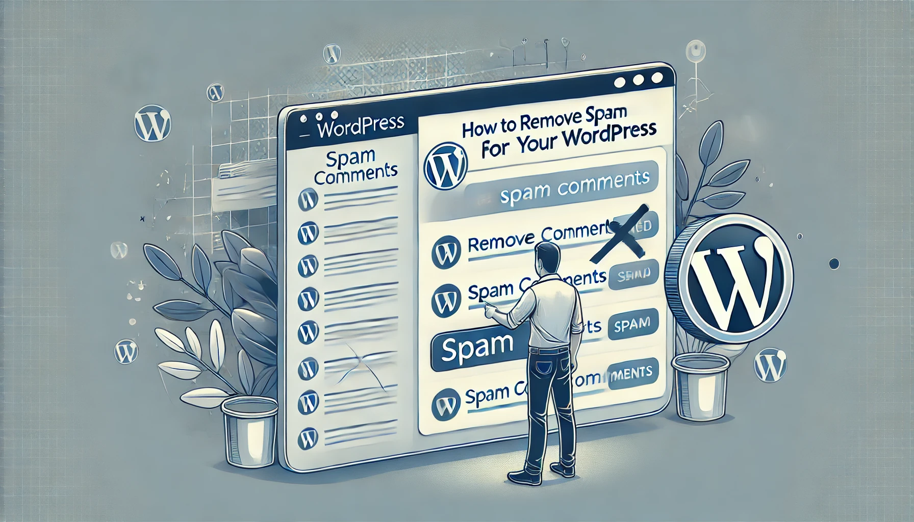
How to Remove Spam Comments from Your WordPress
Learn how to effectively remove spam comments from your WordPress site to maintain a clean and professional appearance."

Why is My Product Page Not Loading? Troubleshooting Guide
Discover common reasons why your product page might not be loading and learn how to troubleshoot database errors, plugin conflicts, and other issues.

Understanding Core Web Vitals and How They Impact Your SEO
A detailed guide to understanding Core Web Vitals and their impact on SEO. Learn how to measure and improve LCP, FID, and CLS for better search rankings.
Ready to get started?
Focus on your business while we fix your website. Contact WebCareSG today for fast, reliable solutions!
Whatsapp us on