Mobile Layout Looks Wrong but Desktop is Fine: A Responsive Design Troubleshooting Guide
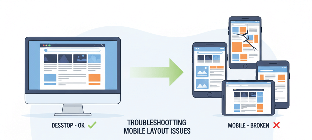
You’ve meticulously crafted your website, and on your desktop, it looks flawless—crisp images, perfectly aligned text, and a seamless user experience. But then you pull it up on a phone, and your heart sinks. Text is spilling off the screen, images are oversized, and buttons are impossible to click. This is a common and frustrating problem for many website owners. While your website may be designed to be responsive, a small misconfiguration can break the entire layout on mobile devices, alienating a large portion of your audience. This guide will provide a practical, step-by-step checklist to help you diagnose and fix these issues, ensuring your website provides a seamless and beautiful experience for all users, no matter what device they are on. For a more comprehensive look at this issue, check out our guide on How to Fix Poor Mobile Responsiveness.
Step 1: The First Diagnosis (Viewport Meta Tag)
The first and most critical step in mobile troubleshooting is to ensure your website has a properly configured viewport meta tag. This tag tells a mobile browser how to scale and display your website, and without it, the browser will assume your website is not mobile-friendly. It is a key part of your overall server maintenance checklist.
- Check Your Website's Code: View your website's source code by right-clicking and selecting "View Page Source." Look for the viewport meta tag in the
<head>section. It should look something like this:<meta name="viewport" content="width=device-width, initial-scale=1.0"> - Add the Tag If It's Missing: If the tag is missing, you can add it to your theme's
header.phpfile. If you are not comfortable with code, you can use a plugin that adds this tag for you.
Step 2: Inspect Responsive Breakpoints and CSS
A mobile layout that looks wrong is often a sign of a CSS issue. You need to use your browser's developer tools to inspect the elements on your mobile layout and see how they are being affected by your CSS. This is similar to how you would troubleshoot other common issues, like a 403 Forbidden Error.
- Use Browser Developer Tools: Open your browser's developer tools (usually by pressing F12 or Cmd+Option+I on Mac) and click the mobile device icon. This will simulate how your website looks on different devices.
- Inspect the Elements: Click on the elements that are breaking and look at the "Styles" or "Computed" tab to see which CSS rules are being applied. Look for media queries (e.g.,
@media (max-width: 768px)) that may be missing or incorrect. - Look for Overly Specific Rules: A common cause of mobile layout issues is an overly specific CSS rule that is not being overridden by your mobile-specific styles. For more on this, check out our guide on common website errors to watch out for.
Step 3: Check Plugin and Theme Mobile Settings
Many themes and plugins have their own mobile-specific settings that can conflict with each other or with the main theme. For example, a page builder might have a mobile-specific setting that conflicts with your theme's mobile styles. This is a crucial step in any server maintenance checklist.
- Review Theme Customizer Settings: Go to Appearance > Customize and look for any mobile-specific settings. Some themes have a separate section for mobile headers, navigation menus, or layouts.
- Check Plugin Settings: Go to each plugin's settings page and look for any mobile-specific settings. A caching plugin, for example, might be serving a desktop version of the page to mobile users. For more on this, check out our guide on fixing a WordPress White Screen of Death.
Step 4: Troubleshoot Plugin Conflicts
If the above steps don't work, a plugin conflict may be the culprit. A conflict can occur when two plugins try to perform the same function or when a plugin's code is incompatible with another. The solution is to deactivate them one by one to find the one that is causing the issue. This is similar to how you would troubleshoot a blank homepage.
- Disable Plugins One by One: Go to Plugins > Installed Plugins and temporarily deactivate your plugins, starting with those that affect the design or layout of your website. After deactivating each plugin, check your website's mobile layout to see if the problem is fixed.
When to Call the Experts
While these steps will fix most mobile layout issues, some problems can be more complex. If you are not comfortable with CSS or HTML, or if your website is still broken despite your best efforts, it is time to call in a professional. An expert can use advanced tools to perform a deep-level diagnosis, fix complex CSS issues, and ensure your website is fully responsive. This is a clear example of a situation where DIY website fixes can make things worse and is one of the clearest 5 signs you need professional help to fix your website.
If you’re still having trouble, don’t worry! WebCare SG is here to help. Contact us today for fast and reliable website fixes.
Related WebCare Solutions

Ethical AI Content: Avoiding Plagiarism and Google Penalties
Learn the best practices for using AI in content creation while maintaining authenticity, avoiding plagiarism, and staying in Google''s good graces.
Improve Core Web Vitals: Practical Fixes for CLS, LCP, INP
A practical guide to improving your website's Core Web Vitals, with actionable fixes for CLS, LCP, and INP to enhance user experience and search rankings.

Understanding SSL Certificates: How to Choose the Right One for Your Website
Learn about SSL certificates, their importance for website security and SEO, and how to choose the right type for your website needs.
Ready to get started?
Focus on your business while we fix your website. Contact WebCareSG today for fast, reliable solutions!
Whatsapp us on