When you visit a website on your phone, tablet, and desktop computer, have you ever noticed how the layout sometimes changes dramatically, other times it smoothly adjusts, and occasionally it looks broken or distorted? This is not random behaviour - it is the result of two fundamentally different approaches to web design: responsive design and adaptive design. As a Singapore business owner, understanding the difference between these two approaches can save you thousands of dollars when building or redesigning your business website. Making the wrong choice means your website either looks unprofessional on certain devices or costs far more to maintain than it should.
In Singapore, mobile internet usage has surpassed desktop usage for several years now. According to data from the Infocomm Media Development Authority (IMDA), Singapore has one of the highest mobile penetration rates in the world, with smartphone penetration exceeding 90% among adults. This means a significant portion of your potential customers are browsing your website on their phones while commuting on the MRT, waiting for their hawker food order, or relaxing at home. If your website does not display properly on these devices, you are losing customers, losing sales, and damaging your brand reputation every single day.
Google also recognises this shift. The search engine giant officially migrated to mobile-first indexing in 2023, meaning it primarily uses the mobile version of your website to determine your search rankings. If your mobile site is poorly designed, your Google search visibility suffers, and potential customers simply will not find your business online. This makes the responsive versus adaptive decision one of the most important technical choices you will make for your online presence.
What Exactly Is Responsive Web Design?
Responsive web design is an approach where your website layout automatically adjusts and adapts to fit whatever screen size a visitor is using. Think of it like water pouring into different containers - the water (your website content) simply flows to fill whatever shape the container (the device screen) happens to be. Whether someone views your site on a massive 27-inch desktop monitor, a 13-inch laptop, an iPad tablet, or a 6-inch smartphone, the content reorganises itself proportionally to use the available space efficiently.
Responsive design is achieved primarily through three technical components working together. First, flexible grid layouts use percentage-based widths instead of fixed pixel widths, allowing columns and content areas to resize proportionally. Second, flexible images and media scale up or down to fit their containers without overflowing or leaving empty space. Third, and most importantly, CSS media queries apply different styling rules based on the device screen width, allowing targeted adjustments at specific breakpoints such as when the screen is narrower than 768 pixels (typical tablet) or 480 pixels (typical mobile phone).
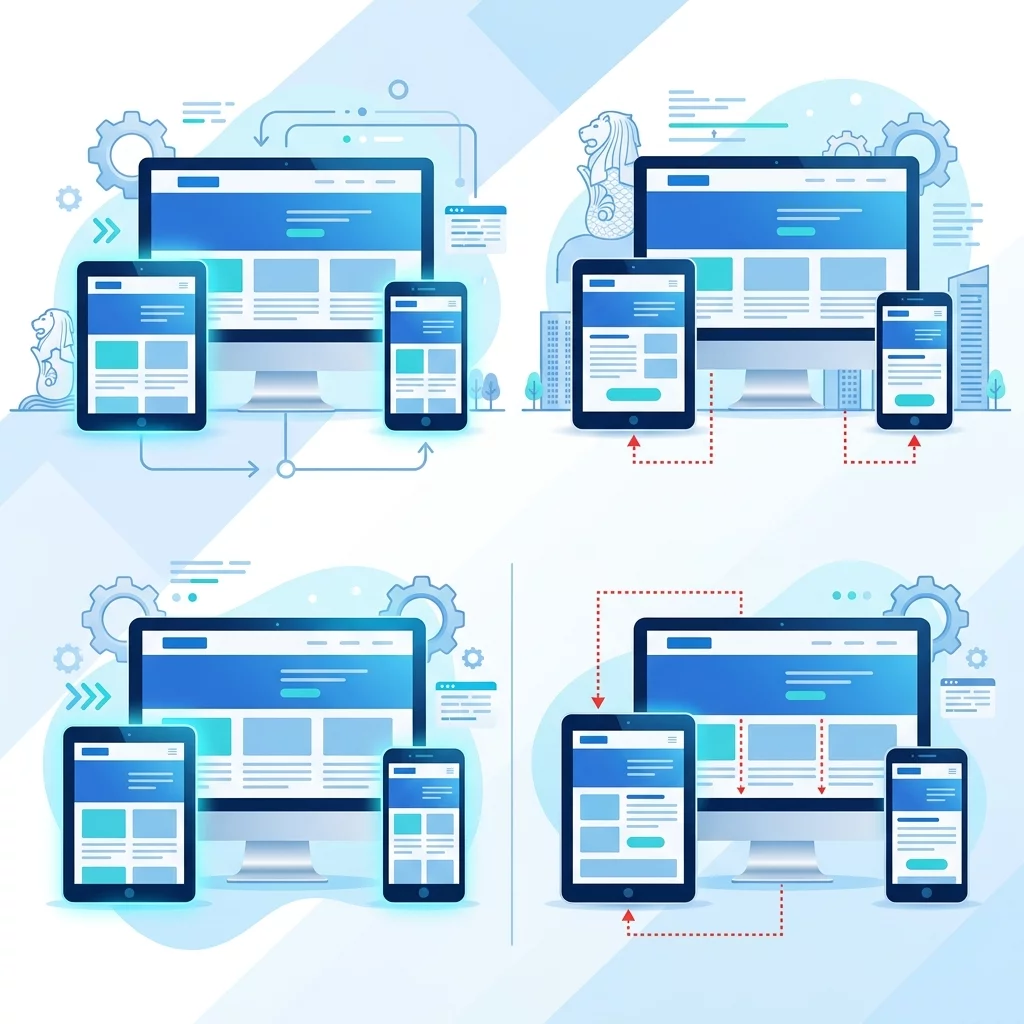
For example, a responsive website might display a three-column layout on desktop with a navigation menu across the top, then automatically reorganise to a two-column layout on tablets by stacking the third column below the first two, while the navigation menu transforms into a hamburger icon that expands when tapped. On mobile phones, it further simplifies to a single column with a clean, vertical stack of all content blocks and a sticky mobile-friendly navigation bar.
What Exactly Is Adaptive Web Design?
Adaptive web design, sometimes called Adaptive Layout (ALA), takes a different approach. Instead of one flexible layout that smoothly morphs, adaptive design creates multiple fixed layouts - called "instances" - each designed for a specific screen size category. The website detects the visitor's device type when the page loads and then serves the pre-built layout that best matches that device category.
Adaptive design typically involves creating six distinct layout configurations: one for extra large desktop monitors (screens wider than 1200 pixels), one for standard desktop monitors (1024 to 1200 pixels), one for tablets in landscape orientation (768 to 1024 pixels), one for tablets in portrait orientation (768 pixels), one for mobile phones in landscape (480 to 768 pixels), and one for mobile phones in portrait (smaller than 480 pixels). Each layout is individually designed and coded, often with entirely different placement of navigation elements, images, and content blocks.
The technical implementation involves the web server or the front-end code detecting the user agent (the device type and browser information) and selecting which pre-built HTML layout to serve. This means that when an iPhone user visits your site, they might get a completely different HTML structure than a desktop user, even though they are viewing the same underlying content.
Key Differences That Impact Your Business
Understanding the technical differences is important, but as a business owner, you really need to understand how these approaches affect your budget, maintenance burden, and ultimately your return on investment. Let us examine the practical implications that directly impact your business decisions.
Development and Initial Build Cost:
Responsive design generally requires building one layout that adapts fluidly, which typically takes less time and therefore costs less upfront. A single responsive design can be built once and will function across all devices. Adaptive design, on the other hand, requires building and testing multiple distinct layouts, with each layout needing individual attention to ensure it looks professional and functions correctly. This multiplies your development costs. For a small Singapore business working with a limited budget, this cost difference can be the deciding factor between getting a professional website or settling for a substandard DIY solution.
Maintenance and Ongoing Updates:
Here is where responsive design truly shines for most small businesses. When you need to update your menu, add a new promotion, change your contact information, or fix any content issue, you make that change once in a responsive website, and it automatically appears correctly across all devices. With adaptive design, any content change might need to be implemented separately in each of your multiple layouts, doubling or tripling your maintenance time and costs. Over the lifespan of your website (typically three to five years before a major redesign), this difference in maintenance efficiency can amount to thousands of dollars in savings.
Performance and Page Load Speed:
Modern responsive websites can be highly optimised for performance through techniques like lazy loading images (images load only when scrolling into view) and serving appropriately sized images for each device. However, some older responsive implementations load all layout variations simultaneously, which can slow down page loading on mobile devices with slower connections. Adaptive design, when implemented well, can serve only the specific layout needed for the detected device, potentially offering better performance in certain scenarios. Given that Google uses page speed as a direct ranking factor, and that Singapore mobile users are often on-the-go with variable network conditions, performance matters enormously for your search visibility and user experience.
Future-Proofing and New Devices:
Responsive design adapts naturally to new screen sizes as they emerge. When Apple released the iPhone Plus models with larger screens, or when new Android tablets with unusual dimensions came to market, responsive websites simply adjusted proportionally without requiring any code changes. Adaptive websites, however, were designed for specific breakpoints, and devices that fell between or outside the defined breakpoints might display suboptimally. As new devices with new screen sizes continue to enter the market - foldable phones, larger tablets, smart watches with browsers - responsive design offers better long-term compatibility without requiring expensive updates.
Step-by-Step Guide: Choosing the Right Approach for Your Singapore Business
Now that you understand the fundamental differences, let me walk you through a practical decision-making process to determine which approach is right for your specific situation. Follow these steps in order and be honest with your answers to arrive at the best choice.
Step 1: Analyse Your Website Content Complexity
Assess the complexity of your website content and layout requirements. If your website has relatively uniform content structures across pages - for example, a straightforward business brochure site with pages like Home, About Us, Services, and Contact - responsive design is almost certainly the right choice. The content naturally adapts well to fluid layouts. If, however, your website has highly complex, unique layouts for different page types - perhaps an e-commerce site with vastly different product listing pages, category pages, and checkout flows, or a news site with complex article templates - adaptive design might offer more precise control over each layout.
Step 2: Evaluate Your Budget Realistically
Determine your actual budget for website development and ongoing maintenance. If you are a startup, small business, or entrepreneur in Singapore with a budget of less than $5,000 for website development, responsive design is the practical choice. Quality responsive templates and frameworks exist at every price point, and even professional custom responsive development costs less than equivalent adaptive development because it requires building only one comprehensive layout system. If you have a larger budget exceeding $10,000 and your specific business requirements truly demand the precision control that adaptive design offers, then the additional investment might be justified.
Step 3: Consider Your Content Update Frequency
Think about how often you will need to add new content, change pricing, update promotions, or modify your website in any way. If you plan to update your website regularly - adding new blog posts, changing seasonal promotions, updating product listings - factor in the long-term maintenance cost of each approach. Responsive design's single-layout update model will save you significant time and money over the years. If your website will remain largely static after launch with only occasional minor updates, the maintenance advantage of responsive design is still present but less impactful over the short term.
Step 4: Assess Your Technical Support Resources
Be honest about the technical support available to you after your website launches. If you plan to maintain the website yourself using a content management system like WordPress or Shopify, or if you work with a freelancer who handles updates as needed, responsive design is far more forgiving. Updates made through most website builders and CMS platforms automatically apply correctly across all device sizes. With adaptive design, your support provider needs to understand how to update each layout variant correctly, which increases the risk of errors and the cost of routine maintenance.
Step 5: Research Your Target Audience's Device Usage
Use Google Analytics to examine your current website visitors' device breakdown if you have an existing site. In Google Analytics 4, you can find this under Reports, then Engagement, then Devices. If the majority of your visitors (more than 70%) are already using mobile devices, that strongly supports choosing responsive design since your priority should be optimising for the most common experience. If you have a business where desktop usage is significantly higher than average - such as certain B2B companies or professional services where clients browse on work computers - your device distribution data helps inform the decision.
Step 6: Evaluate Performance Requirements
Consider any specific performance requirements your business might have. If your website includes video content, large image galleries, or interactive elements that are resource-intensive, assess how each approach handles these elements. Responsive design with modern lazy loading and image optimisation techniques can achieve excellent performance. However, if you have extremely performance-sensitive applications - such as a real-time dashboard, a complex web application, or a site serving primarily users on slow mobile networks in areas with patchy coverage - you may need the more granular control that adaptive design's device-specific implementations can provide.
What Singapore Businesses Should Actually Choose
Based on industry data, the practical realities of small business budgets, and the long-term maintenance requirements, the answer for the overwhelming majority of Singapore businesses is clear: responsive web design is the correct choice in 2024 and beyond. The approach has become the global standard for good reason - it provides the best balance of cost, maintainability, future-proofing, and user experience for the typical business website.
Major websites including Amazon, Netflix, Microsoft, and Starbucks all use responsive design principles. Even companies that initially built separate mobile sites or adaptive layouts have migrated to responsive approaches over time because the maintenance burden of multiple layouts proved unsustainable. Singapore's leading business websites and e-commerce platforms have similarly converged on responsive design as the industry best practice.
Adaptive design is not wrong or bad - it simply solves a different problem that most small and medium Singapore businesses do not actually have. If you run a large enterprise with complex, device-specific functionality requirements and a dedicated development team, adaptive design might be appropriate. For everyone else - the beauty salons in Jurong, the law firms in Shenton Way, the coffee shops in Tiong Bahru, the logistics companies in Changi, the artisan makers selling on handmade platforms - responsive design is the smart, proven, cost-effective choice.
Common Mistakes to Avoid When Making This Decision
Many Singapore business owners make poor decisions about responsive versus adaptive design due to common misconceptions. Understanding these pitfalls will help you avoid expensive mistakes that could impact your business for years.
One major mistake is choosing adaptive design because it seems more "advanced" or "modern." Adaptive design is not inherently superior - it is simply a different approach with different trade-offs. Do not let a web developer convince you that adaptive design is automatically better because it costs more or sounds more sophisticated. The best choice depends entirely on your specific business requirements, and for most businesses, responsive is the more appropriate choice.
Another mistake is confusing "mobile website" or "mobile app" features with adaptive design. Having device-specific functionality - like a click-to-call button on mobile, a map integration on contact pages, or different checkout flows - does not require adaptive design. These features can be built into a responsive design using the same CSS media queries that handle layout changes. You do not need adaptive design to deliver a great mobile user experience.
A third mistake is underestimating future device diversity. The device landscape is not standardising - it is diversifying. New foldable phones, larger smartphones, tablet-laptop hybrids, and emerging wearable devices all present unique screen configurations. Responsive design handles this diversity naturally because it adapts proportionally. Adaptive design, with its fixed breakpoints, can struggle with devices that fall outside expected categories.
How to Discuss This With Your Web Developer or Agency
When meeting with web development companies or freelance developers in Singapore, use this guide to have an informed conversation about your design approach. Ask them directly whether they recommend responsive or adaptive design and why. A competent developer should be able to explain their recommendation in terms that relate to your specific business requirements, not just use technical jargon to justify a preference.
Ask to see examples of their previous work on different devices. Most portfolio websites display on desktop, but ask if they have mobile or tablet versions to show. Request that they show you how their responsive designs handle actual devices - pull out your phone and browse their client sites to see how the layouts adapt in real situations.
Discuss maintenance expectations. How will future content updates work? Will changes automatically apply across all devices in a responsive design, or will you need to coordinate updates across multiple layouts? Get clear answers about the long-term maintenance implications before signing any contract.
If you receive a proposal for adaptive design, ask specifically why they recommend it over responsive design for your project. What specific business requirement or user experience benefit does adaptive design provide that responsive design cannot? If they cannot give clear, specific answers that relate to your actual business needs, treat the proposal with appropriate scepticism.
Request information about their responsive design framework and approach. Modern responsive development uses established frameworks and techniques that ensure layouts work correctly across devices and browsers. Ask about their testing process - they should test on actual devices, not just browser resize tools, and should verify correct display across the range of devices your target audience uses.
Making the Final Decision With Confidence
For Singapore business owners who want a practical, cost-effective website that looks professional, functions correctly, and can be maintained efficiently, responsive web design is the clear answer. The approach has earned its position as the global standard through years of proven results, continuous improvement in supporting tools and frameworks, and unmatched adaptability to the ever-changing device landscape.
Responsive design costs less to build, costs less to maintain, handles new devices automatically, provides excellent performance when properly implemented, and delivers a consistent user experience across all devices. These practical advantages directly translate to better return on your website investment and more time and money to focus on what actually grows your business - serving your customers and building your brand.
The only situation where adaptive design makes genuine sense is when you have highly specific, complex layout requirements that truly need device-specific design treatment and you have the budget to support ongoing multi-layout maintenance. This applies to perhaps 5% of business websites. For the other 95%, responsive design is not just the easier choice - it is the better choice that will serve your business well for years to come.
Making the right choice between responsive and adaptive design does not require technical expertise. It requires understanding your business needs, knowing what questions to ask, and being willing to make a decision based on practical considerations rather than marketing hype or initial cost alone. Use this guide to have productive conversations with your development partner, evaluate proposals critically, and choose the approach that best supports your business goals.
Your website is often the first interaction potential customers have with your business. Make sure that interaction is a positive one, regardless of what device they use to find you. If you still need help, feel free to contact us at https://webcare.sg/contact for a free website health check.