Optimize Images for WordPress: WebP, srcset, and Lazy Loading
In the digital realm, images are often the biggest culprit behind slow-loading websites. A single high-resolution image, especially on mobile, can weigh down a page, leading to a poor user experience and a low Core Web Vitals score. The good news is that you don't have to sacrifice visual quality for speed. By implementing modern image optimization techniques—like converting to WebP, using responsive attributes, and implementing lazy loading—you can drastically reduce file sizes without compromising on aesthetics. This guide will provide a practical roadmap to help you serve the right image to the right user at the right time, leading to a faster website and better SEO. This is a crucial step after you have a solid plan to fix slow website performance.
1. Convert to a Modern Format: WebP
For years, JPEG and PNG were the standard for web images. However, modern formats like WebP offer superior compression without a noticeable loss in quality. A WebP image is often 25-34% smaller than a comparable JPEG or PNG, leading to a significant improvement in page speed. This is a high-impact, low-effort fix that should be at the top of your list, as discussed in our guide on prioritizing speed fixes.
- Use a WordPress Plugin: The easiest way to convert your images to WebP is with a WordPress plugin. Plugins like Imagify, ShortPixel, and Smush can automatically convert and serve WebP images to supported browsers.
- Check for Browser Support: While most modern browsers support WebP, you should ensure that a fallback is provided for older browsers. Most plugins handle this automatically, serving a JPEG or PNG version if WebP is not supported.
2. Implement Responsive Images with srcset
Serving a single, high-resolution image to all devices is inefficient. A user on a mobile phone doesn't need to download a full-sized desktop image. The srcset attribute in HTML allows you to serve different image files based on the user's screen size or device resolution, ensuring they only download the image they need. WordPress handles this automatically by creating multiple sizes of any uploaded image and using the srcset attribute. It is a key part of ensuring your website is mobile-responsive.
- How it Works: When you upload an image to WordPress, the CMS automatically generates different sizes (e.g., thumbnail, medium, large). When you insert the image into a post, WordPress adds the
srcsetattribute, which lists the different image sizes and tells the browser which one to display based on the user's screen. - Manual Implementation: If you are not using WordPress or a plugin that handles this, you can manually add the
srcsetattribute to your image tags.<img src="image-small.jpg" srcset="image-small.jpg 500w, image-medium.jpg 800w, image-large.jpg 1200w" sizes="(max-width: 600px) 500px, (max-width: 1000px) 800px, 1200px" alt="Example Image">
3. Lazy Load Offscreen Images
Why load an image that's at the bottom of a page when the user hasn't scrolled down yet? Lazy loading defers the loading of images and videos until they are about to enter the user's viewport. This can drastically improve the initial page load time and reduce the page's Largest Contentful Paint (LCP) score. It is a crucial step for improving your Core Web Vitals.
- WordPress's Built-in Lazy Loading: As of WordPress 5.5, lazy loading is now a default feature for all images and iframes. This means that if you're on an updated version of WordPress, you're already benefiting from this without any extra work.
- Use a Caching Plugin: If you're on an older version of WordPress or want more control, most caching plugins like WP Rocket and LiteSpeed Cache have a lazy loading option that you can enable with a single click.
4. Use a Content Delivery Network (CDN)
A CDN is a network of servers around the world that store copies of your website's static files. When a user visits your site, the CDN serves the images from the server closest to them. This reduces latency and speeds up your website, especially for a global audience. It's a key part of your overall server maintenance checklist.
- How to Use a CDN: Many WordPress hosts include a CDN as part of their hosting package. If yours doesn't, you can use a service like Cloudflare, which offers a free plan with a built-in CDN.
When to Call the Experts
While plugins make most of these steps easy, complex issues can still arise. If you're using a custom theme, your images are not being served correctly, or your website is still slow despite your efforts, a professional can help. An expert can diagnose complex issues, configure your server for optimal image delivery, and ensure your website is fully optimized without breaking anything. This is a prime example of a situation where DIY website fixes can make things worse.
If you’re still having trouble, don’t worry! WebCare SG is here to help. Contact us today for fast and reliable website fixes.
Related WebCare Solutions
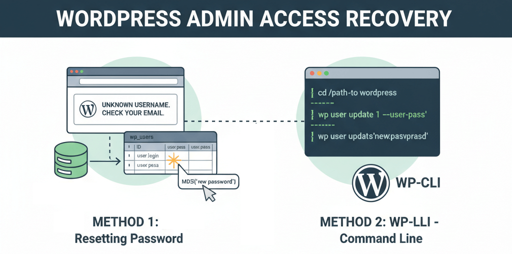
Recover Lost Admin Access: Reset Passwords via phpMyAdmin or WP-CLI
Quick methods to regain admin control using database edits or command-line tools when email resets fail.
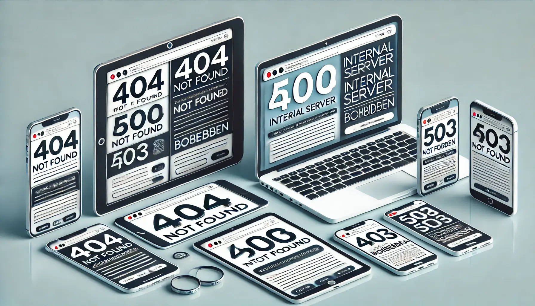
What is a 404 Page? And How to Fix It
When browsing the internet, you may have encountered a page that says 404 Not Found. But what does this mean?

How WebCareSG Fixes Websites Faster (Case Studies)
Discover WebCareSG's efficient approach to website troubleshooting and repair, illustrated with examples of common problems and our rapid resolution methods.
Ready to get started?
Focus on your business while we fix your website. Contact WebCareSG today for fast, reliable solutions!
Whatsapp us on